Landscape orientation in mobile defaults to desktop view

  • 22 November 2016
  • 9 replies
  • 69 views

Hello!

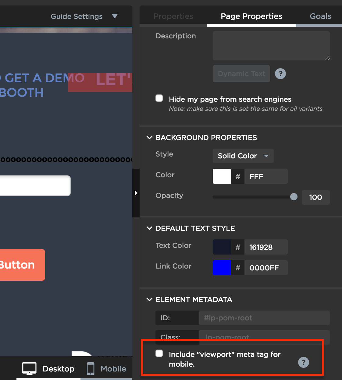
I’ve set up the mobile view in the page editor, and everything show up fine in portrait orientation.
But when I flip it to landscape it reverts back to desktop styles.

Any ideas? Would really appreciate any tips! 🙂

http://firewood.fiestafarms.ca/buy/

Cheers!


9 replies

Userlevel 6
Badge +1

Hey @emilyhype you are doing nothing wrong.

Because of the way that Unbounce uses break points the landscape view will always fallback to desktop scaled to fit screen, on like 90% of phones/browsers as far as I know.

We build all our pages at a width of 980px or 1000px wide so that we get the best possible transition from vertical to horizontal.

Hope that helps.

Userlevel 7
Badge +4

@digibomb curious to know why you build at 980px or 1000px and how you decide between one or the other?

I usually build everything at 940px, but always looking for other opinions on the optimal page width! 🙂

Userlevel 6
Badge +1

@Nicholas super good question. 🙂
The 980 came from the Unbounce PSD grid framework that was released when Themeforest launched there UB category. The PSD is works really well for mobile we find. Not sure how they, either UB or Themeforest, came to that number, but prolly has to do with the CSS grid in the backend.

As fro 1000px. Came out of testing and playing. We find with pages that have larger, as in dimensions, images and big fluid image BGs this work better for scaling.

But honestly no science. If we were discussing a real responsive framework like Foundation or Bootstrap I could give you the validated math behind it 🙂

But I was a 940 guy for a while too …

Userlevel 7
Badge +4

@digibomb awesome stuff. Thanks for sharing. It makes sense.

@Justin and @Jess I’d love to get more of an internal perspective on this. Is there any internal guidance as to the preferred page width that Unbounce template designers use?

Userlevel 6
Badge +1

Totally agree with @Nicholas would love to “learn” more about the internal process for mobile … @Justin @jess

Hi @emilyhype

Just chiming in here as I’m the Product Owner for the builder and I’ve been hearing lots of feedback about how important landscape is (see here for our mobile responsive feedback poll and would love to know your thoughts!). I’m going to go out on a limb and guess that landscape = tablet in this case. Does tablet make up a significant portion of your page visits and how much are you wanting that experience to differ from your desktop version?

Jordana

Hi Jordana,

Thanks for following up, and thanks for the response @digibomb! Interesting conversation going on here 🙂

I’ve filled out the survey and feel like the “not enough views” option is the key one for me at the moment. Even though desktop view works in mobile landscape orientation, some folks might want to really fine tune things. There might be some way to code around this that I haven’t tapped into yet – new to the platform 🙂

In our case landscape = mobile landscape. I feel like the type gets way too tiny for folks to read. Also, we’ve cheated a bit and put some images very close/right up to your guidelines (because we felt the main container was a bit too narrow). So, I understand why on mobile landscape some of our images are touching the edge; totally our bad haha

We’re not officially launched yet, so we don’t have proper stats for tablet view. Totally in testing and tweaking mode, and getting a feel for the platform.

Thanks again,
E

Hi Emily,

Thanks for the feedback! I’m new to Unbounce as well (just joined 2 months ago!) so I’m still getting a feel for our platform as well 🙂

That’s really interesting about the text sizing. Do you have the “include viewport meta tag” turned on for your desktop view? I’m curious if whether that would help at all.

We are actively looking into how we can support landscape/tablet mode! As you’ve seen, it’s a popular request 🙂

Thanks again,

Jordana

Hi there,
I found this thread while seeing if landscape/horizontal orientation switching back to desktop was a bug. After reading the responses, I don’t think I’ve seen a fix for when switching back to portrait/vertical view that it stays in landscape/horizontal orientation. Is there something that I can do to ensure that it will switch back to the mobile size and layout when doing so?

Reply