Landing page feedback please! 🏆


Userlevel 6
Badge +3

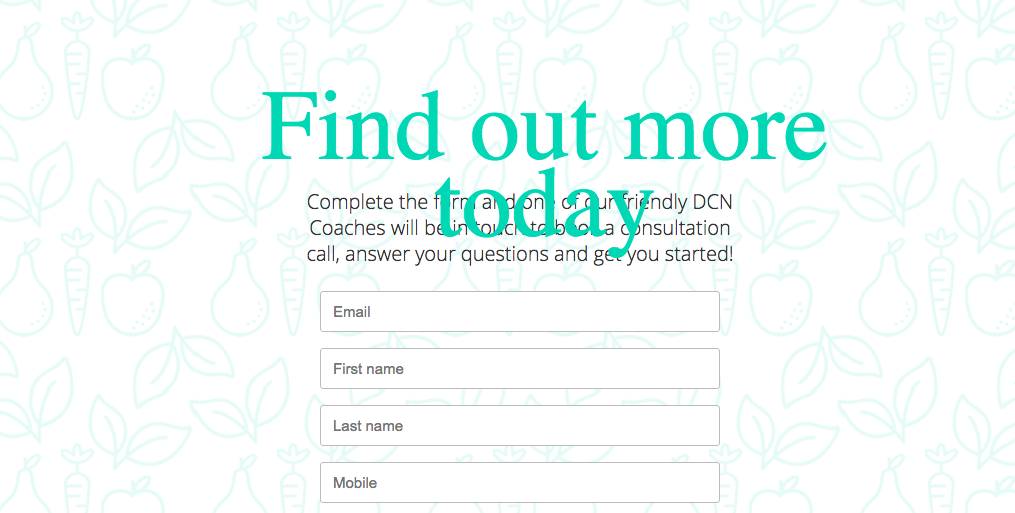
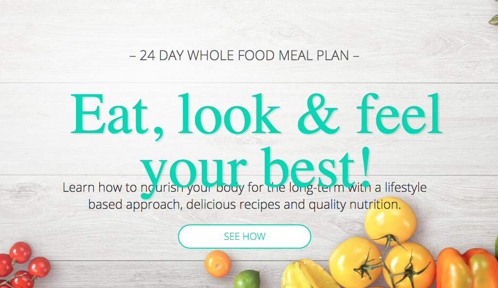
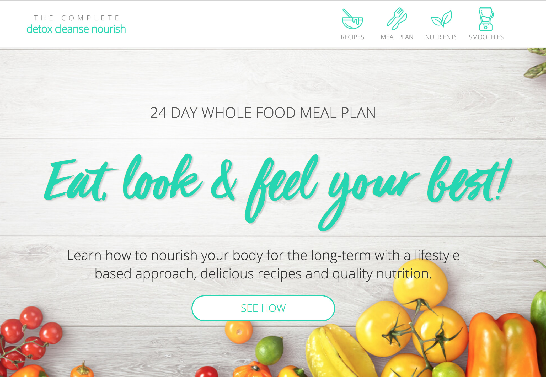
1: What challenge are you currently trying to solve? Give as much detail as possible
I’m wanting to start some A/B testing again on my business’s landing page. 5 years later, and many, many iterations – I’m so close to it, and I would love some fresh eyes and opinions! Specifically around any A/B test ideas or even just general feedback would be amazing.


2: How are you driving traffic to your page?
We have brand partners throughout Australia and worldwide that generate traffic. I want to generate more traffic again via Facebook or Instagram ads, but need to get the conversion rate up first.


3: What is your conversion goal?
Form completion for lead generation.


4: Provide a link to your published landing page / convertable:


15 replies

Userlevel 6
Badge +1

Hey @Zoe_Tattersall nice looking page.

Here are a few suggestions off the top of my head:

Hero (panel 1)

  • Although the font in the “H1” is nice and from a design pov it looks good, it’s not the easiest of fonts to read. There are similar fonts with better legibility. Also, is this a font being converted into an image? If so I’d recommend against that and just output a custom font.

  • The CTA “LEARN MORE” although relevant is redundant with the above sub-copy that already has the word "learn. I’d try something like “SEE HOW” , “GET HEALTHY” , “START TODAY”, etc.

Panel 2

  • I like the icons. But, if you’re going to use them as a nav for the rest of the page I would have them stick to top. Once someone clicks on one they have to scroll all the way back. It breaks the flow. It would be nice to just design out a larger panel with all 4 icons and an opening header and sub-copy.

Panel 3

  • It’s unclear if the user is downloading an app? I don’t see any explanation of how it works once I signup. Is it an mobile app? Online dashboard?

  • If it is an app, I’d show more screens and how it works.

  • I would left align copy to the phone, it will read better. Centered text has been proven to break concentration.

Panel 4

  • I would left align copy for same reason as above.

  • I would put the “SEE MENU EXAMPLE” CTA in this panel

Panel 5

  • Love the images

Panel 6

  • It was unclear to me at first that I could click on the (i) for more info. In fact I thought it was an error and was suppose to read 1,2,3. I’d put copy instead or below that say “see more” or "learn more’, etc.

Panel 7

  • I think this panel is unnecessary. Move the “SEE MENU EXAMPLE” to panel 4 and “JOIN NOW” to panel 6.

Panel 8

  • Again I would left align copy.

  • I feel like this is a nice panel for another CTA below the copy or maybe even a video if you have it.

Panel 9

  • If you have pics to go to with these testimonials

The next few panels are fine. However I find the panel with the two different detox options confusing when they both lead to the same form.

Perhaps have a panel breaking down the 2 plans and have a button leading to inquiry form with a drop down for the 2 options. Or, send each option to a different form. Or, don’t mention the options. Instead just layout the basics and have an enquiry form.

Quick side note: really dig the mobile version.

I hope that helps.

@Zoe_Tattersall

Can you outline your last 2-3 a/b tests and provide any insight into the conversion lift from them? I’d hate to suggest something that you just tried.

I’ll give you a couple of quick off the cuff observations and ask a couple of questions to get the ball rolling.

Do you have any idea what the conversion rates are for mobile v. desktop?

If I click on either “start today” cta in the plan section is there a way that you are notified of which plan I want? I don’t see an option to choose essential or premium.

In the form, how do I as a user know which fields are required? I clicked on book my call and got the error notification but there was no way to tell me how much info I had to provide before I started filling out the form.

I feel like there is a disconnect with the CTA’s on the page. I see learn more, then start today but at the bottom, I am booking a call. So which is it? When I fill out the form am I starting today or am I booking a call to learn more? Am I getting access to a website, or an app? How does it work? I’m kinda left wanting more before I book.

On mobile, how would I know what elements are click-able and which aren’t? There seem to be two styles of buttons. For instance, I did not know that the little i in the meal plan to maximise your results was a button until I moused over it, on mobile, there are no mice. Same for the icons in the green section at the top, I had no idea that was the navigation.

Lastly, I can’t read the font that you use in the hero. It is cool but it isn’t clear. I would test using something else.

It is a solid page. With some UX improvements, I think you will find your missing conversions. If you are not using something like Hotjar to track UX/UI I would strongly recommend it.

Best,
Joe

Userlevel 6
Badge +1

Looks @Joe_Savitch were answering simultaneously without knowing … 🙂

Userlevel 6
Badge +3

@digibomb @Joe_Savitch thanks so much guys, this is AWESOME! 🙌🏾 Half of that is really obvious now, but as I said, I’ve sat so close to it with no outside perspective so it’s great to get your thoughts!

@digibomb

Panel 1

  • Agree about the H1 font – yes it’s an image, it was originally used for some social images, and I possibly got a bit excited with it 😉
  • CTA(s) – to be clear, clicking the button simply means they will receive a call from one of our brand partner to have their questions answered, and get started. I’ll work on trying to clarifying that.

Panel 2

  • I did that section pre-mobile nav menu/sticky header scripts – can totally update it to that now I know how to do it 🙂

Panel 3

  • It’s not an app, it’s an eBook – I’ll try to mention that higher up in the page so it’s not confusing. I used to use a mock-up ‘book’ of it which obviously confused people more; so only show it on an iPad or iPhone now.
  • I designed this mobile first, as almost 70% of our traffic is on mobile (generally via FB), so that’s why a lot of the text is center-aligned. But I think you guys are correct that left-aligned is a better UX experience.

Panel 4

  • Check on left-aligned! Will look at incorporating those CTAs into the other panels.

Panel 5

  • Thanks, food photography is a passion of mine!

Panel 6

  • Gotcha, will think about how to communicate this better.

Panel 7

  • Check.

Panel 8

  • I have a video – see this page version (that I used personally) – http://www.detoxcleansenourish.com/zoe/
    Only reason the video is on this page as that multiple people are using and some of them don’t want me on there, but I can look at doing a more generic brand video maybe.

Panel 9

  • I do, but some people have run FB ads to the page, and FB hates before/after photos which makes it tricky to get ads approved. (Actually please don’t even talk to me about FB ads right now! 🙄)

I used to have the program options as a drop-down on the form, I had wanted to reduce the fields to just the basic info, but this could be an A/B test I can try.

@Joe_Savitch

  • I haven’t A/B tested this version of the page at all! All the A/B tests were done ages ago when the design/branding was totally different. I finally have some time and headspace to look at these pages again now.
  • I don’t know conversion rates, but almost 70% of our traffic is on mobile.
  • No, there’s not – these leads are handed out to our partners for a sales call. The script is to basically suggest the Premium plan and drop to the Essential if $ is a barrier. As I mentioned above, I can look at A/B testing it, but it’s not required info for our partners to close a sale.
  • Excellent point! I’m not how I’ve hidden the * on the fields, will check my scripts/CSS.
  • Yes agree, I need to work on clarifying the CTA and what happens next.
  • Another good point, I’ll look more into better UX for clickable things on the mobile. Will also implement the mobile nav menu/sticky header now I know how to do that.
  • Agree. Sometimes my design background gets me caught up on the ‘cool’ factor. 😳
  • I used to use CrazyEgg, I think I was just too busy and never looked at it – should totally implement this again though. Would you recommend HotJar over CrazyEgg?

THANKS SO MUCH GUYS! You have no idea how helpful your feedback is – I have a number of similar pages, and I think your comments will help me streamline those ones too. 😍

Userlevel 6
Badge +3

Hey @digibomb @Joe_Savitch – I’ve taken on board all your feedback and drafted a new version of this page. It’s not 100% finalised, but would love your feedback again. 🙂

https://www.detoxcleansenourish.com/draft/

Note – custom font is not rendering on mobile, so ignore mobile for now – any ideas on why?

<style>
  /**
  * Do not remove this section; it allows our team to troubleshoot and track feature adoption. 
* TS:0001-07-008
*/

@font-face {
font-family: 'VivaBeautiful';
src: url('https://detoxcleansenourish.com/webfonts/34D3EE_0_0.eot'); 
src: url('https://detoxcleansenourish.com/webfonts/34D3EE_0_0.eot?#iefix') format('embedded-opentype'),
		url('https://detoxcleansenourish.com/webfonts/34D3EE_0_0.woff2') format('woff2'), 
    url('https://detoxcleansenourish.com/webfonts/34D3EE_0_0.woff') format('woff'), 
   	url('https://detoxcleansenourish.com/webfonts/34D3EE_0_0.ttf')  format('truetype'),
    url('https://detoxcleansenourish.com/webfonts/34D77E_0_0.svg#svgVivaBeautiful') format('svg'); 
}

@Zoe_Tattersall

The custom font does work at mobile. The issue is you have to refresh the page after you resize the browser. I use the styler plugin for chrome to do custom font work. It isn’t 100% perfect but it makes sizing elements much better. My preference for custom fonts is the new Google integration, then fonts.com/myfonts.com, then Typekit and lastly self-hosted.

Typekit fonts and self-hosted fonts are the worst in UB…

Ok on to the page!

I will refrain from making comments about mobile as the menu isn’t working well and you said you still had work to do. But it is looking pretty darn great.

Desktop:

Love the sticky nav. Makes sense as you move down the page that I can interact with those elements.

Love the testimonials being higher on the page.

Still not 100% sold on the CTA in the product block. It says start today but then you get down and you are booking a call… so you are not starting today. The message doesn’t match, to me. Also depending on which block I click how does the person responding to the call know what plan I was interested in? If I am the user and I am interested in the $75 plan and someone calls to talk to me about the $100 plan it might feel like I am being “sold” when in fact the person just didn’t know…

Lastly, there are a few “leaks” to the blog etc. which make sense, this is more than just a discrete landing page. However, right at the bottom very close to the main CTA, you have a link to questions. Do you really want to distract someone who might be ready to give you their info with a link (leak) out to the blog? I might consider nixing that at least in an a/b test.

And finally… in the footer, you say like us on FB for latest offers etc. Have you considered a convertable, maybe exit-intent, to ask people to sign up on your site for the latest offers etc? You could see huge wins especially if you are looking to grow an email list.

It’s looking great!

Joe

Just wanted to chime in and say that this thread is solid gold. 🎖️

Some of the ideas and suggestions could help pretty much anyone who’s looking to A/B test and get more conversions. Pinning this to the top of the Community for maximum visibility.

Userlevel 6
Badge +1

Looking really good @Zoe_Tattersall 🙂

I don’t have much more to add to what @Joe_Savitch said, he pretty much nailed it!

However, the fonts are not working on my desktop either, see screens below.

Userlevel 6
Badge +3

Thanks @Joe_Savitch and @digibomb 🙂

Argh #customefontlife is killing me! So I’m seeing it on my desktop, and if I resize the browser – but not on my actual Android phone.

I’m using the Google fonts integration for all the other fonts and the custom header font is from MyFonts.com … I thought I had it set up correctly, but obviously not. Any troubleshooting tips?

I’ve fixed the mobile menu now.

I changed those product CTAs to “register now”, which I’m not 100% sold on as it’s a bit unfriendly, but agree that “start now” is confusing – will brainstorm this more. Will also add the plan options back into the form and work out how to have it auto-select if they have clicked through from one of the “register now” CTAs.

Good point on the footer, I hadn’t even really reviewed that! Minimised the links now too. 🙂

I do have a Convertable for our free smoothie eBook on this page – just not working on the /draft URL. You can see that live on www.detoxcleansenourish.com.

Thanks so much guys, really appreciate all your feedback – it’s been awesome to get some outside direction!

Now to fix these fonts … 🙄

Userlevel 6
Badge +3

Glad my struggles can help some others too! 😂 I will keep you updated on conversion % …

The code you shared earlier is hosted, not called from my fonts. When I loaded up the console I see Failed to load resource: the server responed with a status of 404 (not found) myfontswebkit.css

Lots of other console errors for mixed content on the main page too. DM me and maybe I can help further… key word maybe 😉

Joe

Userlevel 6
Badge +3

OK I finally worked out my fonts – I had to host them on a sub-domain and then edit the .htaccess file to allow for cross-domain editing. whew

So you can see the page a bit nicer now – https://www.detoxcleansenourish.com/draft/ 🙂

Userlevel 7
Badge +3

@Zoe_Tattersall,

Just a small note… you should get an SSL certificate for the blog sub-domain.

Otherwise, the main domain still fails to load the fonts right now.

Also, since you have form fields on the blog, Google Chrome would start showing warnings to visitors who try to fill them out.

Userlevel 6
Badge +3

Yes good point, need to sort that out! The blog has been a minor focus up until recently.

Userlevel 6
Badge +3

Just wanted to say thanks again to all your feedback guys – I’ve just finished (I think!) refreshing this landing page, and starting to roll it out across the other variations.

I’m SO much happier with it now, and hopefully it starts to convert better 🙂

Reply