
Hey Everyone!
We’ve just added 10 brand new mobile responsive templates to our collection, which are available now for all Unbounce customers to use. These new templates are a mix of lead-generation and click-through, and can be customized and tailored to your needs. The new templates are:
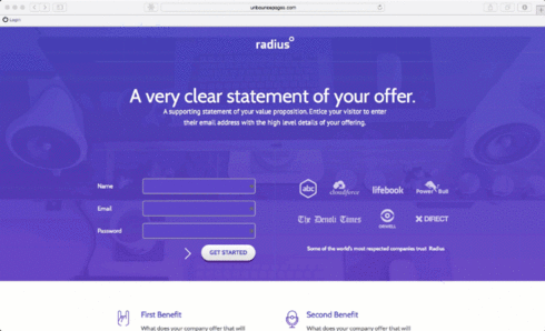
¥ Radius
¥ Polo
¥ Next
¥ Simple
¥ Hamsterapp
¥ HowTo - Recording
¥ HowTo - Webinar
¥ Premia
¥ Librato
¥ Task Check
These new templates also come with enhanced background properties, such as 100% full screen width, or color overlays. Some of them even use this beautiful parallax effect.
You can find these new templates in the app right ** now, **so be sure to go check them out and share your feedback with the community! Finally, to learn more about our internal design and deployment process for these templates, head over to the Inside Unbounce blog and read: More Templates and Background Image Properties by our Product Designer Cole Derochie.