I would appreciate any feedback on our latest landing page


I would appreciate any feedback on our latest landing page. Thank you kindly for your input.

1: What challenge are you currently trying to solve? Give as much detail as possible

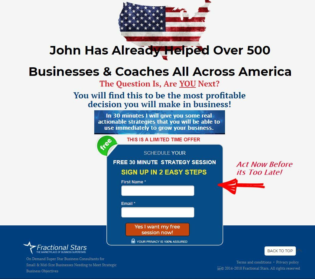
We are using a two step process for those who are wanting to schedule a free 30 minute strategy session requiring very little information, first name and email for step 1. Step 2 takes them to our online calendar to book the appointment. There are so many consultants in the market who do not have the real world experience and we are trying to drive that point along with be specific in the benefits they would get from our consulting services.


2: How are you driving traffic to your page?

We are currently testing the landing page using a networking app to drive 10-20 prospects a week and currently achieving a 12.5% conversion rate.


3: What is your conversion goal?

I am trying to double the conversion rate to 25% before we start using it in our general google ad words PPC program.


4: Provide a link to your published landing page / convertable:
ex. http://www.landingpage.com/

https://ignitemybusiness.bizbuzzamerica.com/simplify-business-success/


2 replies

Userlevel 7
Badge +4

Hi John,

Happy to give some feedback! Here’s a video overview of the page with some ideas: https://screencast-o-matic.com/watch/cFiwcQFPEp

Hope this helps!

Hello John,

A few thoughts:

One thing that keeps showing up in my mind: Chaos.
From what I can read, it seems like you are an extremely talented man who can genuinely help businesses and leaders, but the design triggers my scepticism and makes me think that it’s a scheme because such a" successful man would have a professional designer to help him."
It would be a GREAT investment to have a professional designer re-structure the elements.

  • The bouncing arrow above the fold is almost invisible among all the elements, and nothing is directing my eye so I have no idea where to look. It’s also an extremely small clickable field.
    Make the clickable section larger and easier to see.

  • On such a long page, it would make sense to add another CTA at around the middle.

  • There are way too many fonts / font sizes / font colors for me to know where to focus.
    As I scroll down I’m bombarded with walls of texts in different styles and nothing “stands out” so I just keep scrolling.
    It would help a lot for readability and comprehensions, if fonts and colors were kept to a minimum and only selected parts were highlighted.

  • Terms & Conditions and Privacy Policy aren’t clickable.
    This “scares” me as a prospect.

  • There is no flow / red line to the page, it seems like it’s 5-6 sections from different pages that’s been combined.
    Would advice to make a flow in headlines or design so I feel like I’m being directed through a journey rather than bombarded.

  • A good rule of thumb is that people only read headlines as they scroll down. If the headline catches them, they might read the paragraph. But as such, make sure that on a scroll down, the headlines are clearly visible AND convey the entire message you are trying to come across with, and then the rest of the text then expands on it.

  • The testimonials are amazing. Would highlight some parts of it or make small headlines that captures this, so a scroller will read that small section, even if they are deterred by the blocks of text.

  • I almost couldn’t find the form on the first scroll, it simply hid among all the elements and different colored fonts.
    Here it would make sense to remove some of the elements around it and add more whitespace.

There are a few other things, but these are the major ones for now.
Feel free to message me if you post an updated version.

Have a great day!

  • Andreas Obel

Reply