How to override default breakpoint?


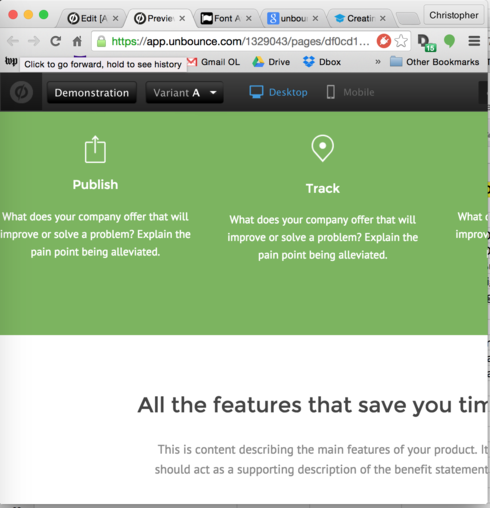
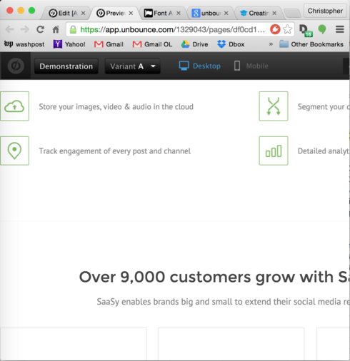
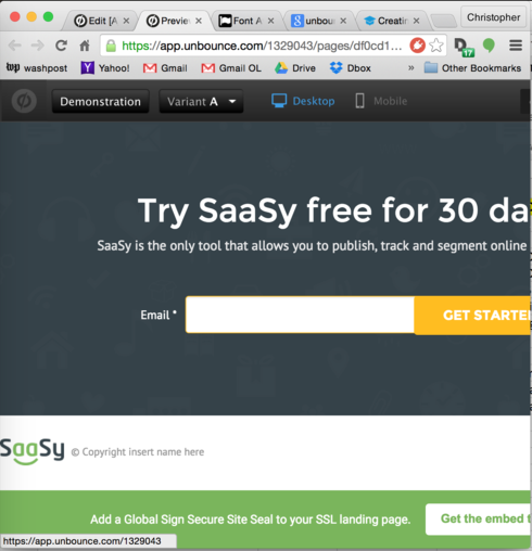
I’m working with a template that starts cutting off text starting when the browser is around 800px wide. But the breakpoint for switching to the mobile (single-column) view is 600px. This is clearly an error as I do not want people with widths between 600px and 800px to have a poor experience. The solution is heartbreakingly simple and yet seemingly beyond me: updating the breakpoint from 600px to 800px. For some reason, I can’t edit the breakpoint in the Unbounce editor; it’s there, taunting me, but uneditable.

Can anybody advise on how to revise a breakpoint?

Thanks so much,

Chris


29 replies

Hey Christopher, 
At this point in time there isn’t a way to edit the mobile breakpoint. With that being said, I don’t think that users with screen sizes between 600px and 800px would necessarily have a poor experience. Can you give me some insight into why you would think that? If you have any screenshots or real world examples that would be super useful. 
Thanks!

Hi Justin,

Thanks for the reply.

Try your “Sassy” template, maximize, then shrink your window. See? There’s a wide range of window sizes for which the right side of the page just just unceremoniously chopped off. No self-respecting “responsive” page would do such a thing, right? The issue is that the minimum width of the template’s desktop UI is >600px. That’s a problem if you’re going to fix the breakpoint to 600px. No sweat if you can change the breakpoint, lousy experience if you can’t. See what I mean?

Best,

Chris

Would be great to see some screen shots of this.  Never searched for the blind spot, but if one is there, put me in line for the solution 🙂

Could you please let me know how you resolve this, Christopher?

Much appreciated,

Joe

Okay, sure thing. See screenshots attached. Steps to produce:

  1. Create a new page with the Sassy template.

  2. Click Preview.

  3. Shrink browser window to before it reaches its 600px breakpoint.

  4. Observe how awful it all looks. Take screenshots. (Attached.)

Can I be the only one who actually shrinks my browser window to see how things will look for users at different browser sizes? It seems unbelievable to me, honestly. Am I missing something huge/obvious? This seems like such a major, in-your-face problem. And I’m having a very hard time convincing myself that I can, in good conscience, use Unbounce landing pages that behave this way.

Thanks,

Chris

P.S. And lest you think this is just one template, I just tried: Produkto – same awful experience – and Good Bank – same awful experience. If you believe the sorting by popularity, these are the top three Unbounce templates. I can try more, but I’m guessing that these are not unique. What gives? Everybody is content to just have awful-looking pages for browsers at these intermediate widths between mobile-narrow and very-wide? Why not show the mobile-width version rather than a version that has content chopped off? It seems to defy all logic. What am I missing?

Chris,

I have to say that I just reviewed one of my own landing pages and found the same issue.  Triggering to the mobile width at 800 pixels may be the best solution.  Heck of a catch, Chris.  I noticed this before on one landing page, but assumed it was user error and forgot to follow up on it.

That said, Unbounce has an awesome support team so if we hang tight for a bit, I have complete confidence they will help us workaround this one 🙂

Best regards,

Joe

Thanks, Joe. It makes me feel better to confirm that I’m not totally crazy/blind here. Perhaps because we have lots of small-organization users throughout the developing world – without the latest high-res Macbooks on their desks – this affects us more than others. But I’d be surprised if there weren’t a zillion less-than-800px-wide browser windows out there even for the average Unbounce user.

I will hang tight and hope that the Unbounce team comes to their senses. It’s literally one CSS setting. They just need to open it to configuration, or give us a work-around to configure it.

Thanks again,

Chris

I can see how if your target audience is in the developing world this could be a big concern.  I don’t think many of my visitors are being negatively affected by this, but I’d like to fix it on principle.  In the mean time, let me know if you find a workaround for this!

Thanks,

Joe

Same issue, same ‘Sassy’ template!

I discovered this same bug when testing on an iPad in Portrait mode, which represents itself as 768px wide, clearly in the gap between 600 - 800px. The content on the right side is getting cut off.

Edit: Found a post from Unbounce regarding tablet-specific breakpoints:

/topics/announcing-mobile-responsive-open-beta-launch
 Justin Veenema, Online Community Strategist

Hi Gian, 
Perhaps I can give a bit of clarity here. Our Mobile Responsive functionality works by utilizing a single breakpoint that defines if the page should be displayed as  desktop or  mobile. This breakpoint is based on browser width, so if a browser under 600px wide tries to view the page - it will automatically display the mobile version. This ensures that your users will get the best experience, whether they’re on desktop or mobile. 

Tablets are a bit different. Generally, when a full-size website loads up on a tablet in landscape view, it will display just as it would on a desktop browser. However, when a page is loaded on Safari in portrait view, the browser will either attempt to load the full-size website zoomed out; or load a tablet specific version of the page. 

Although we don’t have tablet specific mobile break-points, you should be able to load the desktop version on both landscape and desktop without too much of an issue. We’re currently seeing a small bug when initially loading responsive pages in portrait view (only 95% of the page is visible), but this is something we’re aware of and should have a fix for in the future. In the meantime the user might need to pinch-to-zoom to see the entire page, which is something any tablet user will intuitively understand to do. 

Our Mobile Responsive functionality has been implemented to ease the pain point of developing separate mobile/desktop versions of each page. We’re still in Beta, which means some things aren’t final just yet, but we’re almost there and we’re happy to hear any feedback you have about the feature. 

Oh, thanks! I’m not sure that I completely understand that post. It still seems like the Unbounce team making this way harder than it needs to be: allow the breakpoint to be editable, boom, problem solved. Sure, you can say “oh, but the mobile version isn’t ideal for a low-res desktop” but having a fully-visible-but-maybe-not-ideal mobile display is way better than a partly-visible desktop display. It sure seems like a no-brainer to me, so I’m going to keep being puzzled over here at the Unbounce team’s approach to all of this (i.e., not just making the breakpoint editable).

Actually, the good news is that I just tested Sassy outside of the Unbounce editor and the published version does show the entirety of the page in Portrait view on an iPad. So Justin’s comment above was correct: On tablets (i.e. above 600px wide), the desktop view is displayed, but zoomed out to fit the full width of the page on the device. Within the Unbounce editor, it shows it as cropped (same thing happens if you drag your browser window smaller on a published version). But on an actual device it renders in full. Tip: If you are on a Mac, you can download XCode from apple and use their iOS simulator to view the page as it would appear on an actual device.

Hey guys - I want to chime in on this discussion, but I’m going to ask my product team who developed mobile responsive (and set the breakpoints) instead as they’ll likely have way better insight. Hang tight. 

Hey Christopher, Joe and teamriab! The decision to set the mobile breakpoint at 600px was made based on finding the largest common viewport widths from the majority of mobile devices. As teamriab (and Justin earlier in this thread) point out Ñ you will get a different result if you look at your page in a web browser on the desktop at 768px vs. a tablet like the ipad in portrait mode at 768px. The tablet devices should automatically render the desktop version of your page, but shrink it down enough to fit the entire screen (so that it’s not clipped.) Because most landing pages are generally simpler and less interactive that your average website, showing the desktop version on a tablet has proved to be effective enough for most campaigns. I completely understand if this isn’t the case for you though, and would love to hear more about your tablet and 600px+ traffic that you feel is being affected. 

We are working towards building in more visibility around mobile vs. desktop reporting, but for the time being do you have Google Analytics integrated? Are you able to see if you’re receiving a lot of desktop traffic with screen resolutions below your standard desktop page width (940px for many of our templates)?

Cheers,
Carter

For me, I’m not worried about tablets. And it’s just wonderful if tablets show a shrunk version of the full page rather than a clipped version.

But does anybody else care about desktop users who either have lower-res displays or high-res displays but browsers that aren’t maximized? It really blows my mind that we’re still even talking about this. Why would you ever want users subjected to clipped desktop displays when they could get full-width mobile displays? I just don’t get it. (I was pretty sure that the whole world agreed that horizontal scrolling was bad bad bad.)

Hey Christopher, in an ideal world (and one we are ultimately working towards) there would be no browser/device width that content is not optimized for. One of the challenges we faced when building out Mobile Responsive on our current Page Builder is that the flexibility in on our drag-and-drop builder, the ability to move elements anywhere you want and have total control over layout and positioning, is also one of the reasons why it’s harder to handle a “liquid layout” of content to accommodate all screen sizes like you might expect. Today we use what’s called “absolute positioning” to control where elements are placed on the screen. For the majority of customers, this flexibility of the page builder has been more important than optimizing the edge-cases where a screen or browser is in an sub-optimal state like you have described. This is an area we do intend to evolve over time though as we gather data on whether those edge cases are growing.

Hope that helps provide some context.

Yes, I understand the context and the challenge. And I totally get why the “liquid layout” concept is difficult. I don’t even disagree with most ways you’ve managed the trade-off. It’s just that you’ve made two choices that I find absolutely baffling: (1) you’ve decided to set the break-point far lower than the point at which the desktop layout fails to function well (below the point at which it begins being clipped), and (2) you’ve made it impossible for people like me who disagree on issue 1 to change the breakpoint. Now, on 1 we might disagree: maybe you prefer a clipped desktop view to a mobile view, so fine, we can agree to disagree there. But on 2, well, on that I’m having a very hard time indeed. I run a SaaS company myself and so I understand the trade-offs here, but you’ve made about 1,000 other less-important things configurable and yet somehow not the breakpoint. That blows my mind. But thanks for providing the context and thanks for building a product that is still useful and still mostly meets our needs.

And if you ever decide to make the breakpoint editable, you can post that here and then those of us who don’t like clipped displays (for screens or browsers “in a sub-optimal state,” as you say) can take advantage. Thanks again.

I’d like to +1 Christopher’s comments. I’m having the same problem with a custom template and I’m feeling very frustrated. 

I’d like to +1 Christopher’s comments. I’m having the same problem with a custom template and I’m feeling very frustrated. 

Hello there,

what I am not getting from the conversation below is:
a) is unbounce working toward a third breakpoint oput of the box(meaning seperate tablet experience)
b) is there any way to manipulate a site so that there is a way to change the default breakpoint of a template

We see 20% plus traffic on our sites coming from tablets and first tests indicate that we can lift conversion by around 30% if we offer an adjusted tablet landingpage - so this is starting to be a real bummer for us.

Would be very cool if I could get a rough estimate on when this might find it’s way in the service, also I appreciate any workaround that is worth a try :).

Hi there,

Same problem here it would be great if we could :

A. set up our own breakpoint (different from 600px)

OR 

B. get access to a 2nd breakpoint for portrait mode on tablets / landscape mode on smarthpones

Any update or estimate ?

Thanks !

+1 I would like to have an editable breakpoint option too.

This is also an issue when viewing the page in landscape on mobile phones. Some page elements aren’t compatible with mobile so we need to remove them in the mobile variant, but a user viewing the page in landscape on a mobile device will see these broken elements. Please fix asap.

Yeah would love to see a custom breakpoint.

For me this is a deal-breaker I think. I was about to convert to Unbounce from Lead Pages after seeing Oli talk at an event earlier in the year.

My Lead Pages membership (annual) is due to expire very soon and I was going to make the switch to Unbounce. But the single breakpoint issue is a bad one for me 😦

I get the issues and constraints etc and the fact it’s important to make the site easy to use for folks, but still… I’d LOVE a 2nd, custom breakpoint!

This seems to have been requested multiple times over the last year or two though, with no solution or even ETA of a solution as far as I can tell, which makes me sad!

I’m now going to have to have a big rethink of moving from Lead Pages to Unbounce 😦

@Christopher_Robert What i ended up doing was using a CDN for bootstrap/materializecss/ etc. using their grid system i and custom coding html i was able to fix this issue.

I agree with you-- Its a shame that unbounce neglects these breakpoints out of the box. Clearly everyone doesn’t function their web views @ 600px OR 1600px width. Furthermore, not being TRUELY responsive, and stumbling upon a clipped page chips away at my brands credibly in the eyes of a new user.

After 2 years, @Carter has this request/issue been fixed? @Christopher_Robert any proposed solution?

Reply