

TLDR; This Smart Script will determine which content to show and which content to hide depending on what mobile device your viewers are using.
Hello, I’m Oren, the founder of London-based digital agency, Kurve. I’m a growth hacker and digital marketing consultant to startups in the UK and Europe.
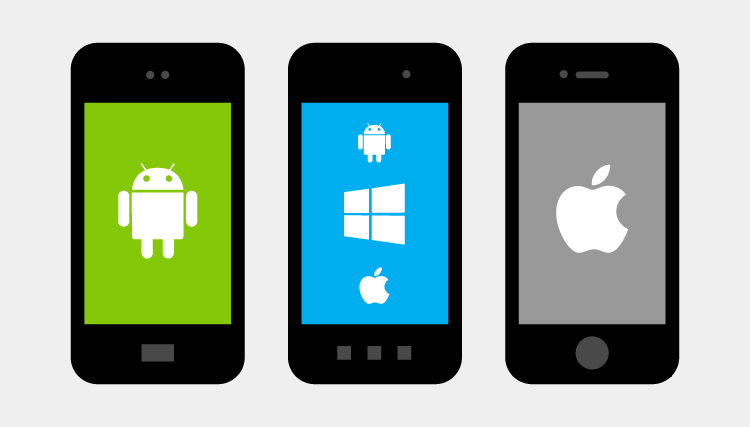
It’s no secret that only the relevant elements should be displayed to users on particular devices, in order to avoid driving away potential conversions.
For example, if an Android user arrives on your landing page, they won’t benefit from a download button if the product is only available on Apple iOS.
This landing page script was used in one of our client’s projects and I wanted to share it with the Unbounce Community. Basically it will deliver an alternative CTA (such as an email form) to ensure that no users hit a device-related roadblock.
See this script in action (on mobile) here!
How to Install in Unbounce
Click Here for Instructions
🚨
This is not an official Unbounce feature. This functionality is based entirely on third party code, and has only been tested in limited applications. Since this isn’t a supported Unbounce feature, our support team will be unable to assist if things go awry. So if you are not comfortable with HTML, Javascript and CSS, please consider consulting an experienced developer.
Before we Begin
When you’re building your landing page, you’ll need to add all of the elements stacked on top of each other. This will look messy in your page builder and when you preview your page, but the benefits far outweigh that messiness.
For example, if you’d like to include a CTA that allows a user to Download On Apple Store, and Download On Google Play, place them in identical positions, and depending on which device your users are on - it will show the corresponding button. It’s fully customizable, and you can manipulate every element without advanced coding skills.
Scripts Needed:
<script src="//ajax.googleapis.com/ajax/libs/jquery/1.4.2/jquery.min.js" type="text/javascript"></script>
<script>
    var isMobile = {
            Android: function() {
                return navigator.userAgent.match(/Android/i);
            },
            BlackBerry: function() {
                return navigator.userAgent.match(/BlackBerry/i);
            },
            iOS: function() {
                return navigator.userAgent.match(/iPhone|iPad|iPod/i);
            },
            Opera: function() {
                return navigator.userAgent.match(/Opera Mini/i);
            },
            Windows: function() {
                return navigator.userAgent.match(/IEMobile/i);
            },
            any: function() {
                return (isMobile.Android() || isMobile.BlackBerry() || isMobile.iOS() || isMobile.Opera() || isMobile.Windows());
            }
        };

         if(isMobile.iOS()){
        $("#lp-pom-image-110").css('display', 'block');
     $("#lp-pom-image-111").css('display', 'none');
     $("#lp-pom-form-112").css('display', 'none');
    }else if(isMobile.Android()){
     $("#lp-pom-image-110").css('display', 'none');
     $("#lp-pom-image-111").css('display', 'block');
     $("#lp-pom-form-112").css('display', 'none');
    }else{
     $("#lp-pom-image-110").css('display', 'none');
     $("#lp-pom-image-111").css('display', 'none');
     $("#lp-pom-form-112").css('display', 'block');
    }
</script>
Instructions:
Step 1.
Copy the latest Cross_Device script and paste it into the Javascripts section of your landing page with placement ‘Before Body End Tag’.
Step 2.
Replace the IDs in the script (in each if/else statement) with the element IDs of each element that will be displayed conditionally.
Step 3.
In the first if statement, ensure the conditional element that will display for iOS is being set to display: block. All other elements should be set to display: none.
Step 4.
In the next else if statement, ensure the conditional element that will display for Android is being set to display: block. All other elements should be set to display: none.
Step 5.
In the last else statement, ensure the conditional element that will display in all other cases is being set to display: block. All other elements should be set to display: none
💡 Tip: The ID field in the Element Metadata section is crucial for the script, as it denotes the ID of the element. Quite simply, add the IDs of each element to the relevant fields in the script’s code [Download CTA]. For example, add the Apple Store’s element ID wherever you see #iOS_element_id in the code.
Testing
Like anything else you implement on your page, you’re going to want to test this out thoroughly to see what effect (if any) it has on your conversion rates. We recommend running an A/B test and segmenting a small portion of traffic towards the page - just to be safe.
Conclusion
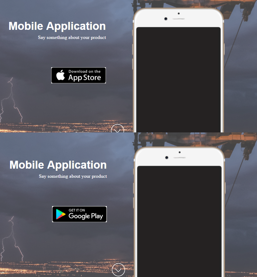
Right here, you can see two instances of the same page. If you visit the live version on different devices, you’ll see that it delivers the most appropriate version for you.
I can’t stress the importance of dedicated landing pages, especially for PPC campaigns; Google AdWords, Bing Ads, and sponsored social media. Unbounce is an excellent solution for creating conversion-led landing pages, without the need for in-depth coding knowledge.
Arguably, one of the most beneficial features is the ability to publish multiple versions within the same group of pages. This allows for iterative A/B testing, and conversion rate optimization. By implementing our smart script, you can test different designs across different devices, and optimize as required.
If you have any trouble, tweet the Kurve team and we’ll sort you out.
Can’t see the instructions? Log-in or Join the Community to get access immediately. 🚀
Want to take your Unbounce landing pages + Convertables™ to the next level?
 Check out the Ultimate List of Unbounce Tips, Scripts & Hacks

