I’m creating a landingpage. I have created a sticky header - which somehow ended up being full width no matter which resolution i’m in - which is nice. I want the same for the images in my sections. When i click on a link in the menu, it will jump to a next section with a big image (background image) and an overlay with text. The image should be as big as the screen resolution. How do i get these images to follow the size of the browser that the user is using? The attached image is taken i n 2560x1440, and i get the white spaces to the left and right (but not in the menu??? :o ) I don’t need it to particular fit 2560x1440, but i just want it to follow the screen size.
Any good solutions to this? 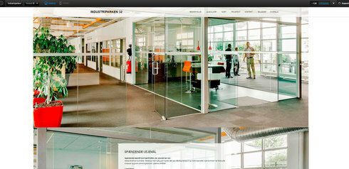

Getting images to be full screen/full width
Userlevel 7
 +3
+3
Hi Annelise,
This should be an easy fix.
Select your page section and in the right sidebar locate Background > Advance Setting. There you’ll find a couple of check boxes - “Stretch background to page edges” is the one you need.

Best,
Hristian
Hristian, that could be a solution, but it makes the background image sticky. I have a long page with various sections after each other, with different images that needs to be displayed. Therefore i can’t use that solution. But thanx.
Userlevel 7
+3
Hi Annelise,
I’m not really sure what you mean by “makes the background image sticky”?
Best,
Hristian
Reply
Log in to the Unbounce Community
No account yet? Create an account
Enter your username or e-mail address. We'll send you an e-mail with instructions to reset your password.