Feedback on LP

  • 18 September 2017
  • 5 replies
  • 1 view

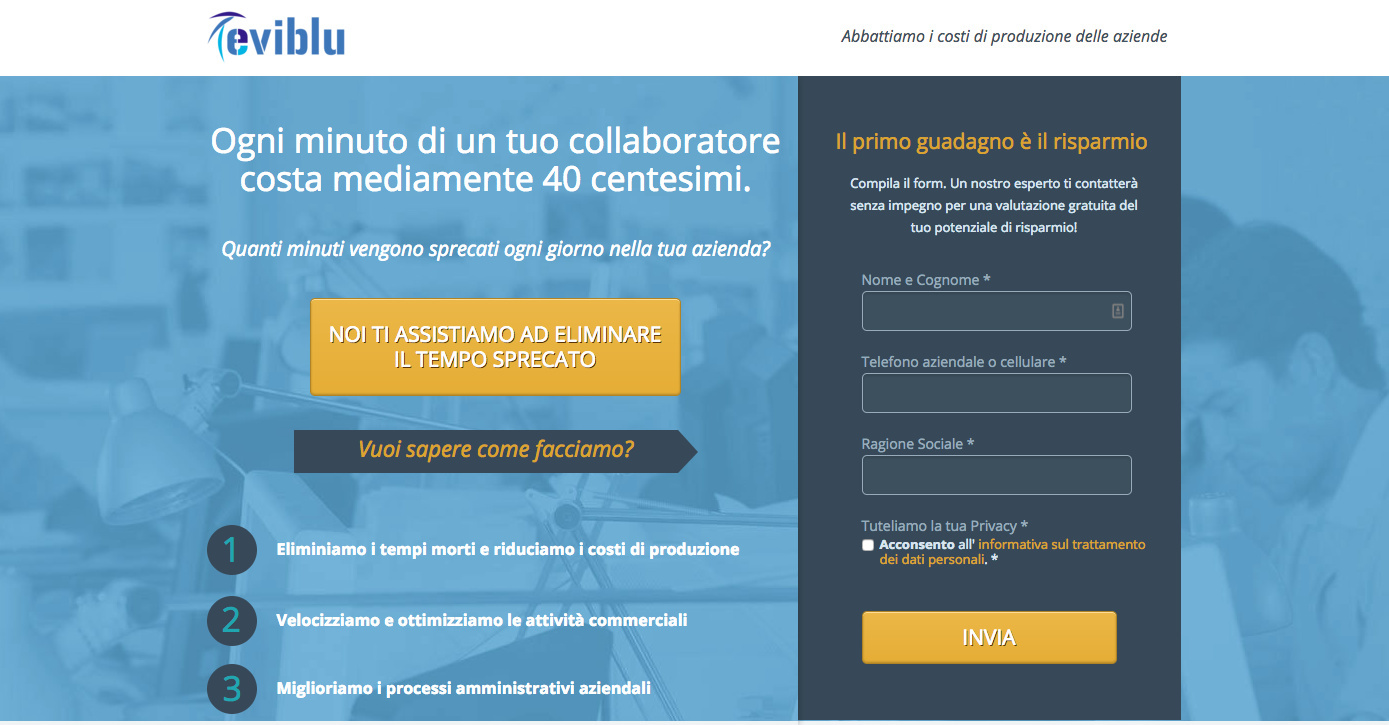
1: What challenge are you currently trying to solve? Give as much detail as possible
I see from Hotjar that many users enter, stay 4-8 seconds and then immediately go out.
I suppose they hardly read a single line of text. Maybe they feel attacked by the prominent form?
Perhaps it could be better to make them curious in the header area and to move the form at above after scrolling a bit to find the solution to their curiosity?


2: How are you driving traffic to your page?
Google AdWords


3: What is your conversion goal?
at least 3%


4: Provide a link to your published landing page / convertable:
http://www.eviblu.eu/


5 replies

Userlevel 7
Badge +4

Hey there,

If they are bouncing that quickly, it’s usually either a traffic problem or they don’t understand what the page is offering, compared to what they were expecting.

Looking at the page, from a design perspective, it’s not bad. It looks like you used a very standard layout for lead gen pages which is good.

As for the copy, I had to use Google Translate, but from what I can gather, the offer is just a free consultation of some sort? It doesn’t seem very clear. So I’d start there. I’d recommend testing different offers. Do you have a lead magnet you can offer, like an ebook, free webinar, etc?

Also, there’s a big yellow button on the left side of the header that doesn’t seem to do anything. Is it supposed to? If not, you might want to remove it, so that the focus is on the main CTA button.

Best of luck with the page! Let us know if you have any questions and thanks for sharing.

It’s a leaN consultation service. We help companies to reduce production costs. We didn’t use any lead magnet since we only wants the phone of users seeking for a consultation (bottom of the funnel).
In another campaign, where I sold lead generation services I had about 7% conv.rate with a similar proposal but a different design:


I’ve created the same structure for this campaign:
www.eviblu.eu
and I am wondering if it would be better than the Unbounce page, since the users receive separated messages and almost all of them scroll down to the final form.
Maybe a form in the header is too aggressive whereas the other layout inspire curiosity to scroill down to follow the sentences?

Hey mdagosti, from a quick look at your page (translated to English), I don’t think having the form above the fold is your issue. Overall the page design is sound, but the messaging needs to be clearer. Here are a couple of ways you could try and improve performance.

Headline

Since I had to translate the copy, some of the nuance is lost. But it’s clear in your headline you have a negative statement about business productivity, followed with a question subhead.

Instead, I would combine the negative statement with a benefit statement.

Something like:

Wasted work time is killing your profits
Eviblu stops the waste and makes you more efficient

Then a subhead like:

We’re business optimization experts. We can help you:

  • Eliminate dead times and reduce production costs
  • Speed ​​up and optimize business processes
  • Streamline corporate administration

Also, I would move the “arrow” pointing to the form below these bullets.

Yellow CTA button

The button on the left breaks up the flow, and doesn’t seem to be doing anything. I would remove that.

Form background

The dark blue/gray bar behind the lead capture form breaks up the page, confusing the eye. Try making that dark background extend just slightly beyond the form fields, rather than one big solid chunk.

Form headline

Your form headline doesn’t say what the offer is. In English, it says “the first gain is the savings”. I would change it to something like “Speak to one of our experts today”

Form CTA Button

Make the button copy more action-oriented. Instead of “SEND” try something like “See how much I can save"

Hope that helps.

Thank you very much BradW.
Great advices!!!
I have just created a new variant in Unbounce, following your suggestions. I didn’t get completely your advice about the form background but I tried to make it a bit transparent in order to avoid breaking the main layout.
You should be able to see the new page at the usual URL since I set the new variant as the winner for now.
What do you think about it?
Thank you very much again!

Hi mdagosti, glad to help! And the new version of the page looks like an improvement. Hard to speak on the copy since I’m seeing a translation, but the layout looks cleaner. Let me know what kind of results you see with the new page.

– Brad

Reply