Feedback on https://get.labster.com/simulations-university/


Hello everybody,

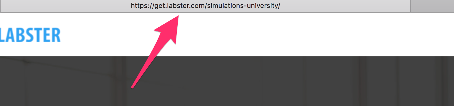
I would like to elicit some feedback from you concerning our marketing funnel setup for https://get.labster.com/simulations-university/. Especially interesting for me is wether you understand the offering and if not, what’s missing from your point of view to make it more clear to first time visitors.

Also, what is your take on the best practice for a sign up page for a SAAS product? Freemium, discount, both? Other alternatives? Feel free to share any interesting links.

Thanks in advance,

Yves


10 replies

Userlevel 7
Badge +1

Hey Yves!

WOAH! This page is slick! The Simulation Catalogue is particularly impressive. Your copy is clear, concise, and you’ve done an excellent job at including features and benefits. In terms of design and messaging, I think you’ve nailed it.

My only suggestion would be that with a SAAS product like this, your potential customers may be ready to start right now, and losing a lead that’s ready to get going — and potentially start paying — is a heavy loss. Would you consider adding a sticky nav to your page that follows your user along the journey with a subtle CTA, something similar to your ‘Get Started’ button.

We’ve got a post in Tips and Scripts that can show you how that’s done, if it’s something you’re interested in trying out:

I’d be curious to hear what the @Unbounce-Experts have to add in regards to discounts or special offers for SAAS sign up pages.

Userlevel 6
Badge +4

Hi @YvesWilken, great starting point!

In regards to Freemium vs Discount I would go for freemium paired with an automated lead nurture process (emails guiding users to features with paid account as goal) taking place upon signup.

Unlike @Jess I did not understand the offering right away. I wonder main headline could be changed? What is your main value proposition (what need will I as a user get covered).

  1. Do I need a real life laboratory or 2) do I need to learn science topics more effectively? I would perhaps argue that my need is #2 while #1 is a way of getting there - and would make the headline about #1. A good headline also completes the sentence “I want to…”

So based on that - here’s an idea: H1 “Learn science topics more effectively”. H2: “Try our state-of-the-art virtual lab and see how you can improve your grades”.

Another thing I noticed when clicking “Get Started” was that I was taken to what seemed like a second landing page. Once you get me to click the call to action you have me “sold” and I was expecting a signup form. I would incorporate some of the content from your second page (USPs, pricing etc), and skip that second page altogether.

Also make sure to set a title for the page.

Hope this makes sense 🙂

Hi Jess, thanks a lot for you input. Will discuss it. Yves

Hi Finge, thanks for your feedback. Added title and meta description. Yves

Always love hearing your feedback, @Finge!

Userlevel 6
Badge +1

I agree with both @Finge and @Jess I won’t repeat what they said, but when I clicked on “GET STARTED” the secondary page made more sense as to what I was getting started with.

I would shorten the process by including the “Free Trial” info on the main page and adjust the CTA to reflect this “START YOUR FREE TRIAL” or something along those lines.

I’d lead into the paid plans after they have tried it. I would consider and email campaign for that. The main objective, as I see it for this campaign, is just get them signed up so you have a way to contact them and up sell them later. Get them excited about the product first.

Just my two cents 🙂

Thanks for your contribution. I see some trade offs when merging the two existing pages: the page will get quite long, it will get cluttered, it will load slow especially on mobile. The idea is to separate a value based communication (first page), to get users interested. Form a sales based communication (second page), to remove hurdles for signup. What do you think? @Jess @Finge

Userlevel 6
Badge +4

When merging them, don’t use all the content. Kill your darlings and keep it tight. As for mobile you can set parts of the page not visible so the page won’t become too long. This is something we always do for mobile pages.

I would definitely keep it as one page, and a signup in a lightbox. To remove hurdles for signup you can create a bigger Lightbox and add a customer testimonial next to the signup form. We have seen massive uplifts in CVR just adding testimonials.

See example here:

Hi Finge,

I understand that a freemium version - at best without credit card - in combination with a lead process is the obvious way to go. But I kind of have the feeling that this space is maturing quickly and that a lot of startups and cloud services go for a paid only version more quickly than it used to be. What would be your advise for a best practice with such a setup, when the user definitely had to pay a one month fee?

Thanks

Yves

Hello everybody,

we updated the landing page and incorporated some of your advice (see https://get.labster.com/simulations-university-1/). Feel free to share your feedback.

We encountered some trouble, when it comes to the mobile version - there’s always the need to adjust a lot. And the page speed is low. Any advice or best practices?

Thanks in advance,

Yves

Reply