


Hey everyone 👋
I thought I’d share a few quick pointers for anyone who’s just getting started with editing their desktop and mobile landing pages in Unbounce.
✖️ The Problem
“The changes I do on mobile are impacting my desktop view.”
“I want to be able to change my mobile site and not affect the desktop site. But every time I change mobile desktop gets changed as well or vice versa.”
“How can I make changes to my LP mobile version without affecting my web version?”
✔️ The Solution
The elements that you have on your page (in both desktop and mobile builders) are actually connected together, and when you switch between them, you are moving the same element. Sort-of like the reflection of a mirror. The changes you make in one builder are going to influence the other builder as well, but there are a few tips to make this work to your advantage.
1. Mirror Image
Be aware that any time you add or delete an element on one version, it will do the same on the other. Each time this happens we’ll give you a little warning at the bottom-right of your canvas.
2. Layout Assistant
Unbounce has this handy little tool called Layout Assistant that will do most of the heavy lifting when it comes to formatting the mobile version. When you first switch over to mobile, simply navigate to the Layout Assistant tab and click choose a specific section, or choose All Sections.

3. Force Independent Changes
To move elements without affecting the desktop version (and vice versa), hold down the Command key (mac) or Control key (windows) when you drag an element. This will allow you to move elements outside of a page section on one view without affecting the placement of the element in the other view.
4. Resizing Text
To resize text, rather than changing the text size (which will affect both views), use the scale bar.

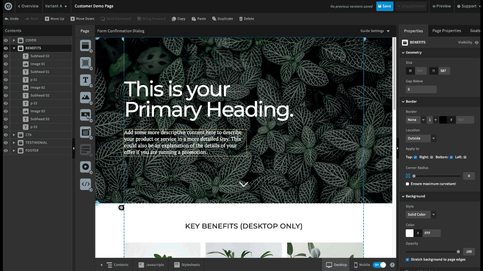
5. Page Contents
If you want to get a better sense of how your elements are laid out on the Z axis, open up your Page Contents panel by clicking the Contents button at the bottom left of your screen.
6. Hide Elements and Page Sections
Sometimes it’s difficult to have everything from your desktop version on your mobile as well. Don’t fret, you can simply hide elements in either desktop/mobile from appearing on your page.
💡 Tip: This works for images, text, boxes, buttons, forms - and entire page sections.
To hide elements, rather than deleting elements that won’t fit in your mobile responsive version, click on the Contents button at the bottom left, then click the eye icon beside the element you’d like to hide.

@Raivo also shared a very helpful workaround that saves time when editing your desktop and mobile content:
🔗 Related Resources
For a more detailed instruction on how to use Mobile Responsive, check out this Documentation