Hi there, does anyone knows how to create the “Float” animation from this page https://ianlunn.github.io/Hover/ for boxes on the Unbounce builder?
Thanks!
Best answer by Jess
View original
Hi there, does anyone knows how to create the “Float” animation from this page https://ianlunn.github.io/Hover/ for boxes on the Unbounce builder?
Thanks!
Best answer by Jess
View original

 +1
+1
Hey @Tanguy!
My coworker @Luis_Francisco is amazing and put together a landing page and styled the button to make some of these instructions easier to digest.
Click here to see the button hover in action!
Here are some quick instructions to put this together:
<script>
var x = document.getElementById("lp-pom-button-13");   // Replace with your button ID
x.classList.add("hvr-float-shadow");
</script>
It should look like this:
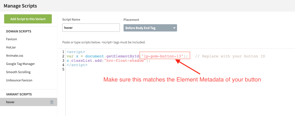
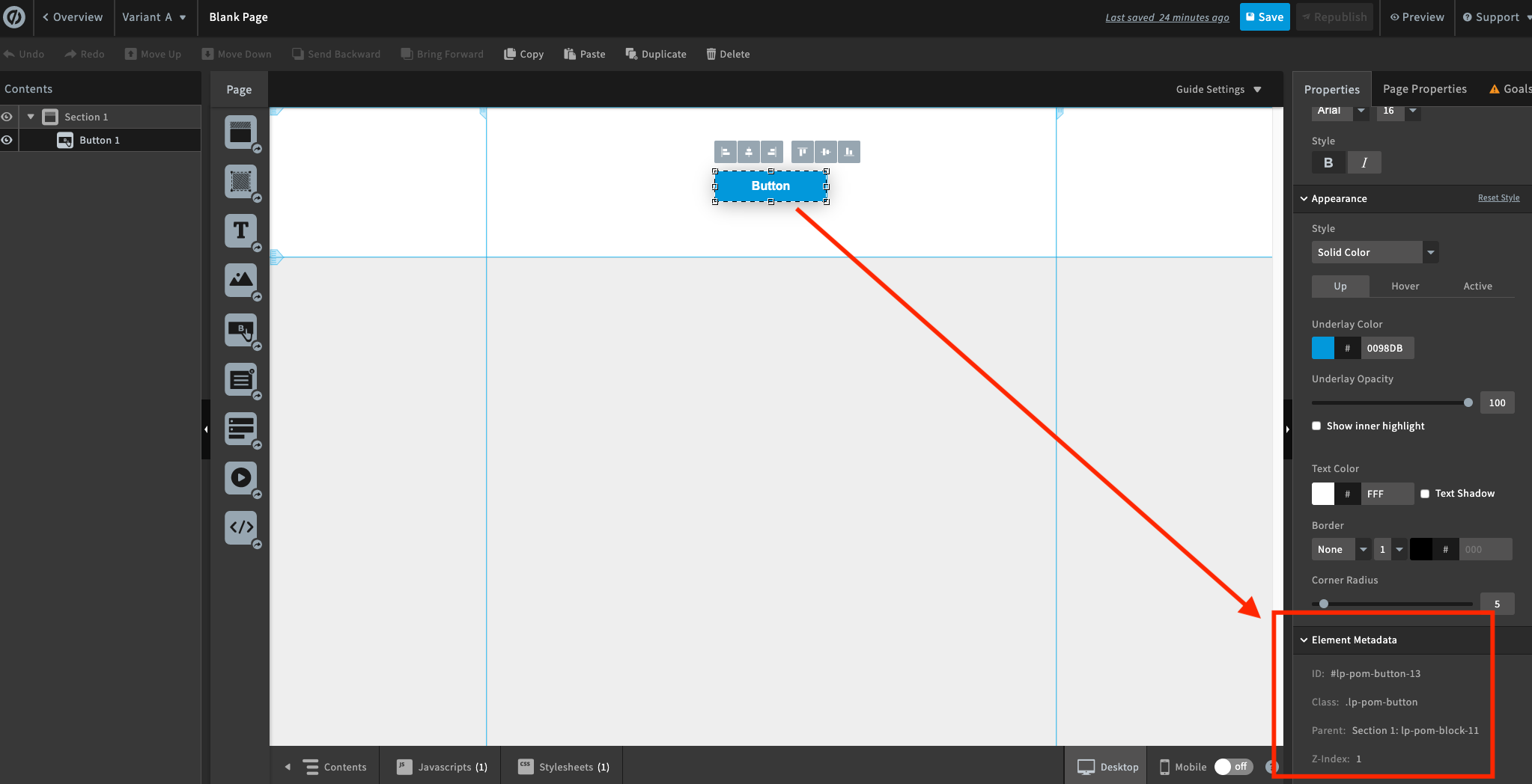
This is where you can find the Element Metadata of your button (or other element you want to apply the effect to):
<style>

  .hvr-float-shadow {
  display: inline-block;
  vertical-align: middle;
  -webkit-transform: perspective(1px) translateZ(0);
  transform: perspective(1px) translateZ(0);
  box-shadow: 0 0 1px rgba(0, 0, 0, 0);
  position: relative;
  -webkit-transition-duration: 0.3s;
  transition-duration: 0.3s;
  -webkit-transition-property: transform;
  transition-property: transform;
}
.hvr-float-shadow:before {
  pointer-events: none;
  position: absolute;
  z-index: -1;
  content: '';
  top: 100%;
  left: 5%;
  height: 10px;
  width: 90%;
  opacity: 0;
  background: -webkit-radial-gradient(center, ellipse, rgba(0, 0, 0, 0.35) 0%, rgba(0, 0, 0, 0) 80%);
  background: radial-gradient(ellipse at center, rgba(0, 0, 0, 0.35) 0%, rgba(0, 0, 0, 0) 80%);
  /* W3C */
  -webkit-transition-duration: 0.3s;
  transition-duration: 0.3s;
  -webkit-transition-property: transform, opacity;
  transition-property: transform, opacity;
}
.hvr-float-shadow:hover, .hvr-float-shadow:focus, .hvr-float-shadow:active {
  -webkit-transform: translateY(-5px);
  transform: translateY(-5px);
  /* move the element up by 5px */
}
.hvr-float-shadow:hover:before, .hvr-float-shadow:focus:before, .hvr-float-shadow:active:before {
  opacity: 1;
  -webkit-transform: translateY(5px);
  transform: translateY(5px);
  /* move the element down by 5px (it will stay in place because it's attached to the element that also moves up 5px) */
} </style>
Let me know if that works. Let me know if you get stuck anywhere 🙂
-Jess (but mostly @Luis_Francisco)
It is working brilliantly. Thank you so much!!
@Jess @Luis_Francisco
Perfectly illustrated solution and an awesome effect too!
No account yet? Create an account
Enter your username or e-mail address. We'll send you an e-mail with instructions to reset your password.
