Convertible Feedback. Can you help?


Hey you guys,

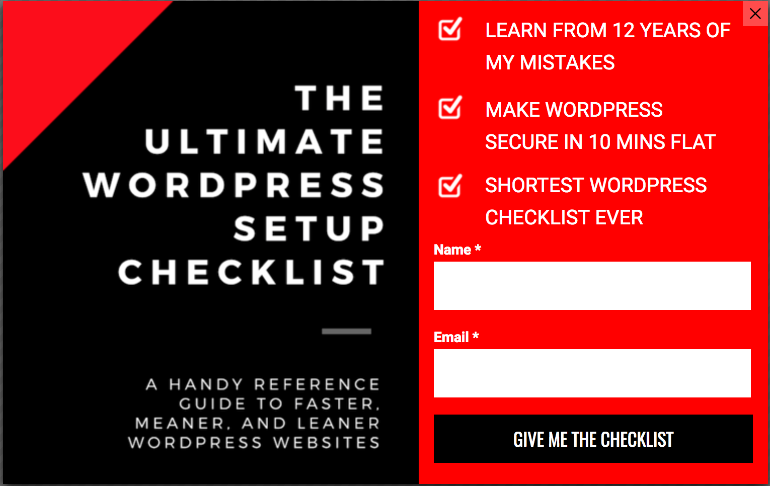
I wanted to use an overlay to start getting sign-ups for my business. I’d appreciate it if you can give me some feedback on it? The black, white, and red are in keeping with the branding and to match the look of rest of the site.

Please let me know.

Ash


10 replies

Userlevel 7
Badge +1

Hey Ashwin!

Firstly, purely from a design standpoint, I love this! I love the colours and the layout and the minimalist design. I guess my only feedback right off the bat might be to do more with the image on the left. It looks a bit incomplete with the phone being cut off in the middle. There’s definitely potential for something with a bit more detail.

Secondly, I think it helps to know how you’re using this Convertable. How is it being triggered? Would you be willing to send the landing page that you’ve applied this to? That way it gives a lot more for us to work with when we’re giving feedback.

I know a lot of our customers have seen a ton of success using Convertables, but I think it’s more than pure design that makes it effective. I’d like to loop in @digibomb and @Finge as they’re my go-to guys for Convertables right now 😁

Cheers!

Hey @Jess,

This particular was to stand on its own and do its thing. I did have another landing page for the same offer: http://fetchprofits.com/monsterlist – but I kept this one minmalistic.

Now that you mention the image, I guess I have to work on these two (page and the convertable) again.

What else can we do to make it work? Any thoughts?

Ash

Userlevel 6
Badge +4

Hi there. Cool design!

I would make a few changes.

  1. Not sure the iPhone image adds any value as it pretty much repeats what is already said in the headline. Remove it and replace it with what you have on the right half of it.
  2. Instead of having a click-through button I would add a form with the 2 form fields from your landing page in your now new clean canvas on the right half

Hope this helps 🙂

Hey @Finge,

  1. Removed the iPhone Image. It was just taking space and not adding any value.
  2. Added an email field.

🙂 We’ll make it rain

Ash

Userlevel 6
Badge +1

Completely agree with @Finge the only other thing I would suggest is maybe adding a picture of a person. Something relative.

And though I agree with @Fingein regards to adding a form, a clickthrough can work here too as long as you’re sending them to another page that has added value like maybe a video or something, or screens of the tools, examples, etc.

I wanted to add my own photo there, but I don’t think I have a great photo that goes well with the convertable/landing page thingy. A little something what Noah does on this website 🙂

Ash

Userlevel 6
Badge +1

There are some great places to source images that can be used copyright free. I like unsplash or maybe a really nice icon of some kind. Just a thought 🙂

So, the happy Ash went looking out soon after 🙂

Userlevel 7
Badge +1

Hey Ash! If you’re willing, I’d love to see the finished product! Very curious!

You asked for it, @Jess. The beautiful blue blue here on the community is going to look brash and loud with my black and red riot.

I didn’t find images or icons yet. But since these are live, showing up on the site, I’ll keep them this way until I can change them like @digibomb and @Finge advised.

My Monster tool Marketing Stack Giveaway Convertable

Where does it show? Here and there.
Conversion stats for now: 3.54%
When is it displayed?: Exit Intent

My Funnel Checklist (Duplicate of the first one)

Where does it show? For posts in Email marketing, Automation, and sales funnels categories.
Conversion stats for now: 0% (Just launched, no traffic yet)
When is it displayed?: Exit Intent

Wordpress Checklist

Where does it show? On My “Wordpress related posts”
Conversion stats for now: 2.56%
When is it displayed?: Exit Intent

I am feeling naaaty 🙂

Reply