Solved

Convertable Email Popup Modal Breaks iPad Portrait View

  • 12 July 2017
  • 7 replies
  • 1301 views

Hi all,

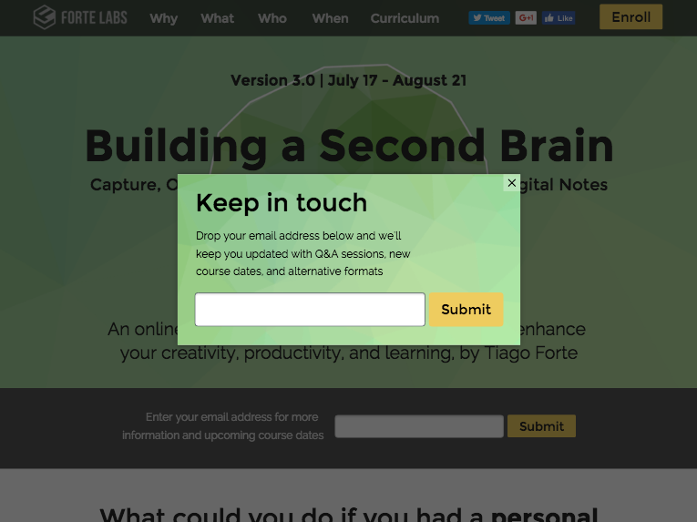
I’ve started working with someone on their unbounce landing page, and I’m running into a strange issue with their email popup modal Convertable. When viewing the landing page with an iPad in portrait mode, the page is appropriate scaled at first. It looks fine. But when the popup loads, the iPad zooms in, cutting off the right side. Here’s a gif:

I suspect there’s some goofiness happening with the viewport. As you can see in the gif, if I rotate the iPad, it fixes itself. I’m guessing that’s because this function (which appears to be included automatically by unbounce) triggers on rotate:

<script type="text/javascript">
  function updateViewport() {
    var viewport = document.querySelector('meta[name="viewport"]');
    if (viewport && window.innerWidth > 600 && window.innerWidth < 1024) {
      var defaultDeviceWidth = window.innerWidth;
      var defaultPageWidth = document.getElementById('lp-pom-root').offsetWidth;
      var calculatedScale = (defaultDeviceWidth / defaultPageWidth);
      var viewportContent = 'initial-scale=' + calculatedScale + ', user-scalable=yes';
      if (defaultDeviceWidth >= defaultPageWidth) {
        viewportContent = 'initial-scale=1.0, ' + 'width=device-width, ' + 'user-scalable=yes';
      }
      viewport.content = viewportContent;
    }
  }
  lp.jQuery(document).ready(updateViewport);
  window.addEventListener('orientationchange', updateViewport);
</script>

See the issue for yourself: http://buildingasecondbrain.com

Help?

icon

Best answer by Brian_Burns 26 September 2017, 20:43

View original

7 replies

Userlevel 6
Badge +1

Hey @ben very strange indeed. I cannot seam to replicate this on my end (see screen below). I do not get same “zoom cut off effect”. It works fine for me.

I suspect it may be a refresh issue. What happens if you start in landscape mode? I’ve notice this with many responsive frameworks, when you change the viewport without a refresh there can be glitches.

It could also be browser and browser version. What browser are you running on your iPad?

The effect was reported to me by someone with an iPad (no idea of specifics), but to reproduce the issue I had to use the iOS simulator that is bundled with Xcode. The simulator is running iOS 8 but won’t won’t show me the Safari version.

I’m not deliberately changing the viewport (that I know of), but it must be changing when the Convertable triggers.

The width of your screenshot is 768px, which indicates to me that you should be seeing the issue (the threshold is below 950px, which is why landscape-first does not have the issue). Hm…

Hey @ben,

I took a look into this and it appears to be occurring on iOS 10.3 but not in iOS 9.3. We wouldn’t really support iOS versions below iOS 9. I’m going to have the team investigate a fix for the issue and will update you with what’s found.

Thanks for bringing this issue up and for the detailed information. I hope you’re having success using Convertables and hopefully we can get this resolved asap.

Regards,
Brian

Great, thanks so much for looking into it, @Brian_Burns!

Hey @ben,

I’m happy to let you know that we’ve just deployed a fix for the issue you reported above. I’ve checked out your page and the zooming in is no longer occurring on an iPad. If you’re still seeing any issues let me know.

Regards,
Brian

Thanks @Brian_Burns! :clap:

Just tested, and this fix is perfect. Thank you!

Reply