
Mobile devices are now so entrenched in the customer experience that if you’re not catering to this portion of your audience, you’re officially leaving money on the table.
When you think about it, it’s been almost 2 years since Enhanced Campaigns became de facto in AdWords (meaning you can’t target desktop users alone anymore; you have to consider mobile viewers too), and last quarter 67% of emails were opened on a mobile device. This means that if your emails aren’t directing customers to mobile-optimized landing pages, over half of your reach is meaningless.
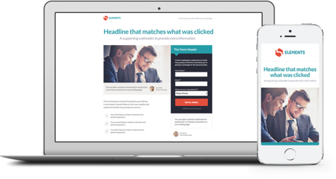
If people click through to your landing page from an email on their phone, your landing page has to display perfectly on a smaller screen size or your chance to convert is over. Half of email recipients will delete an email that doesn’t look good on their phone, so imagine how many will bounce from your landing page if it isn’t responsive.
With 79% of smartphone users keeping phones on, or near them, for all but two hours of their waking day, it’s never been more important to serve up mobile responsive landing pages that adjust to different screens.
Tips for Transitioning
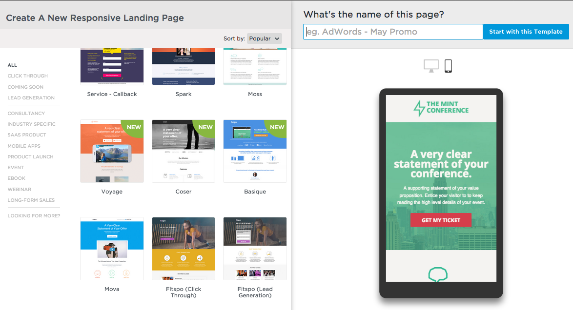
Lucky for you,all the page templates in Unbounce are mobile responsive, so if you’re using these, you’re golden (and likely have very few adjustments to make on your mobile layout).
But if you’re building from a blank page in Unbounce, or working to convert older landing pages into mobile-ready masterpieces, here are 3 tips for updating these pages:
1. Craft secondary, mobile-specific copy
Your potential customers don’t read every word of web copy on a desktop landing page (we all tend to scan to pick up needed info), so keep the text on your mobile layout brief.
Visitors want to scroll through and quickly pick up your main points. So work on refining a powerful (but to-the-point) headline, supporting bullet copy, and CTA. Also remember that although pinch-to-zoom works on phones, you definitely don’t want your audience to have to use it.
Ditch long paragraphs, small typefaces, and don’t just copy over the text you’ve used on the desktop version of your landing page (mobile shouldn’t simply be a shrunken down version of your desktop page). As Bryan Eisenberg explained in an Unwebinar, think of your desktop page as a full course dinner, but the mobile version of your page as a snack.
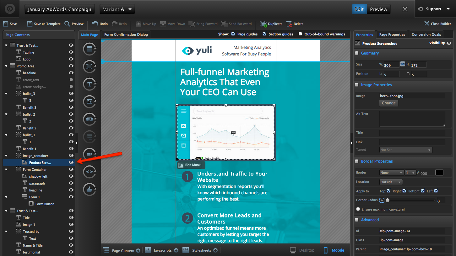
To remove unneeded page elements or text boxes in Unbounce, use the visibility selector from the Page Contents panel, accessed from the button on the bottom left of the Page Builder. Just select the object in either mobile or desktop view to make it visible or hidden there:
Overall, use only as much copy as it takes to persuade visitors to click your CTA (which can be fast on a phone where we tend to consume info quickly, and make snap decisions).
2. Design your desktop page layouts with a linear flow that translates well to mobile
When building your pages, remember that the information hierarchy Ð or sequence of information on your page Ð matters, and a linear flow of info can help when it comes to creating your mobile page view.
Focus on taking folks through the info they need to convert in a logical progression. Start first by ensuring they know what your company is and the offer up for grabs; then get into the reasoning behind why someone would want your offer, then offer up social proof, and present folks with your call to action where it’s appropriate (i.e. when they have enough information to make the decision to buy-in).
As an example of this persuasive design in effect, take a look at how Oli Gardner revised a landing page design to present information in a more linear way.
He rearranged this page:
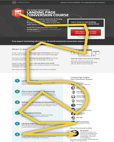
to present the same info in a more linear (and logical) way:
Not only is a linear design like this better for your audience to consume and understand on a desktop (this redesign resulted in a 33% conversion lift!), but the layout also translates over to mobile devices better because mobile pages present info in a narrow layout.
If your initial page is designed section by section, with a logical top-down progression, this makes for an easier time when transitioning to the mobile view. It can make a big difference in the time you spend rearranging page elements to fit a more narrow device screen.
3. Use the Layout Assistant button as a handy shortcut
If you toggle to the mobile tab in the Page Builder and find that there are tons of elements out of bounds in your mobile layout, there’s now a handy shortcut you can use to wrangle in all the components with just the press of a button.
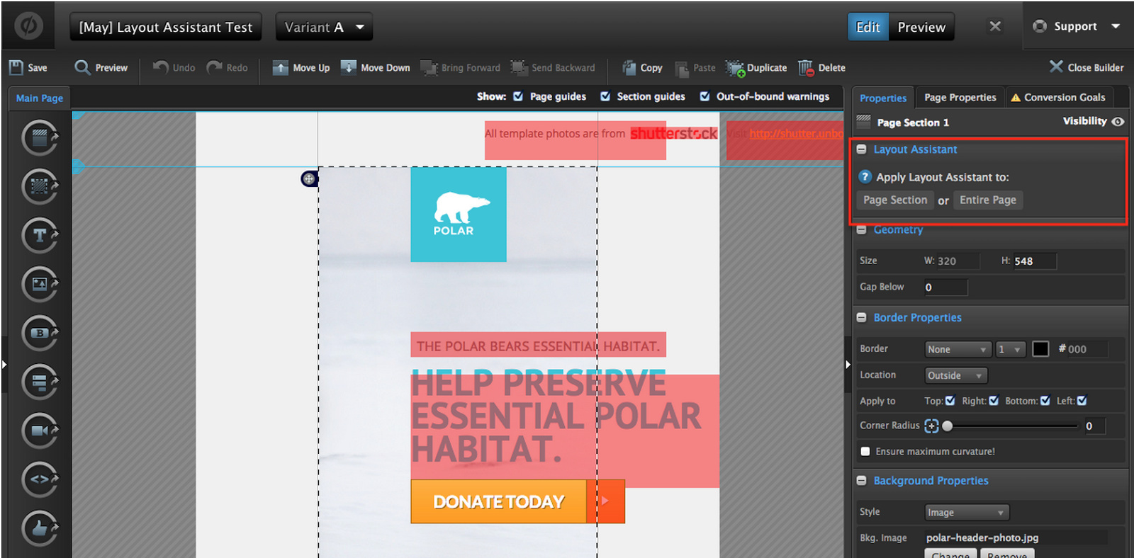
If you select a page section,then head to the properties pane and click the Layout Assistant button (like in the image below), this will rearrange your page elements to better fit your mobile layout. You can choose to apply Layout Assistant to an entire page, or to individual page sections.
Presto chango! The page will rearrange to better suit a mobile view (check it out):
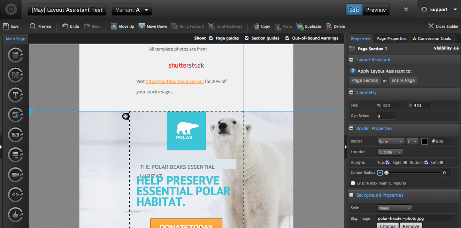
The Layout Assistant button will get you about 80% of the way to a perfect page. From here, you can adjust tiny elements as needed for perfect formatting, and then publish in half the time it would take to drag all the elements around manually.
For best results, click the Layout Assistant button before any minor adjustments to your page.
Now that’s a timesaver!
You can read more about using Layout Assistant here.
Share Your Tips Have you transitioned any of your blank landing page designs to be mobile responsive yet? We’d love to hear your tips below! Share your advice for what makes an especially great mobile landing page layout, or tell us about your experience using the Layout Assistant buttons! Did they cut down your turnaround time?