2-column Hubspot form

  • 10 August 2020
  • 2 replies
  • 18 views

Hi there,

I’m using Hubspot forms and I’m trying to create a 2-column form.

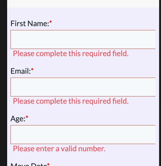
I’m able to create one without any issue on laptop, but then on mobile, it doesn’t really work, because the form fields are wider than the screen itself, as you can see here in this 1-column form:

Why is this happening and how can I use the form field width to be at 100% on mobile? Has anyone faced this issue before?

Thanks,


2 replies

Userlevel 7
Badge +1

Hi @nunosbpereira 👋

An option might be to create a second iframe for your Hubspot form on the mobile version of your page, and hide the desktop version on that page. It might make it easier to adjust for smaller dimensions.

Here’s a link to some documentation on creating mobile responsive content on your pages.

Hope that helps! Let me know if you have any questions 🙂

-Jess

Thanks, Jess, this really helped!

Reply