Hi,
I need some technical help aligning some elements on a LP - Please check the demo version at http://unbouncepages.com/temp53985091534893425/
I’m not a developer so I cobbled together and copy pasted code examples to get the look and functionality close to what I want. A lot of trial and error involved, of course.
Because the code is cobbled together from different sources, not everything works perfectly well together.
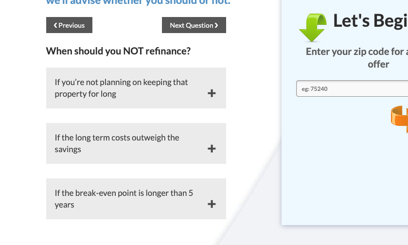
I’m stumped with the a couple of issues. See https://snag.gy/HTzv5w.jpg and https://snag.gy/GyaQev.jpg
How do I get the accordion title text to have a margin or padding on the right and also get that + sign to align in the vertical center. Again, not a developer but I tried all sorts of combinations of div, span, p tags, tried editing the css, etc. but couldn’t get it to work. It seems like I’m missing something simple.
I would really appreciate some help from some of the experts here. Thanks!

