What are we doing wrong? Please critique our squeeze page

  • 17 November 2015
  • 9 replies
  • 2 views

I could really use your input on a squeeze page that we put together for a free Working Solo Toolkit designed to help entrereneurs and freelancers get things done (and to build our email list). 

We put this together and thought that we were onto something, but we’re finding that not many people are signing up.

The page itself can be found here:

http://coffeebreakuniversity.com/toolkit

We are generating traffic by running a Facebook ad targeting some different groups that we think would be interested in tools for working solo, as well as our content and mission in general. So far we’ve been targeting groups that have expressed an interest is certain areas like working parents, freelances, small business owners, etc. 

I’m not sure where the hole in the funnel is, whether it’s who we’re targeting, the ad or the squeeze page. 

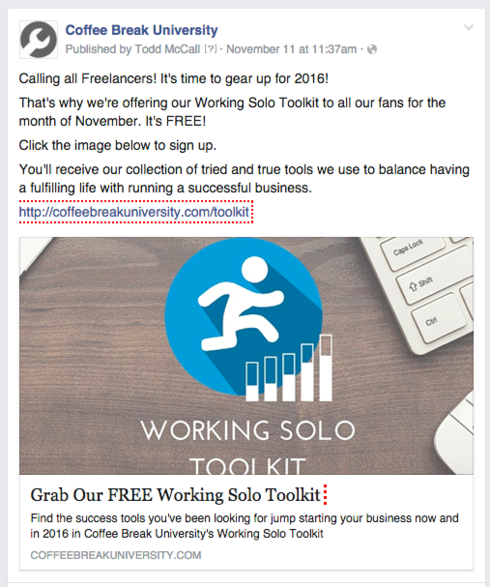
Any thoughts or feedback would be greatly appreciated. I’ve also attached an image of our Facebook ad as well for reference.


9 replies

Hello Teresa,

Great to make your acquaintance and it will be a pleasure to review it.  I have a few meetings, but will set aside some time this evening to help you out.  Also thanks for sharing the source of the traffic 🙂 gives a lot more context to your situation.

Hang tight,

Joe

First thing I notice is no “promise” in your headline. Might you consider “Jump-Start Your Business Now” - with our FREE Working Solo Toolkit. (is it free?).

I agree with Roy.

The headline needs to be your USP, which is helping freelancers grow their businesses.

Secondly, the product image further down the page could do with being more visually appealing! If your giving away some kind of eBook that’s a tool kit then display an image that makes visitors think - eBook/toolkit.

Here’s how Unbounce do it… Look at how simple and straight forward it is! 🙂

http://get.unbounce.com/lpo-beginners-toolkit/

Consider how you might add urgency also to your tool kit. Perhaps include a coupon for a % off a download and change it  each month or quarter, you can then add a count down!

Just a few ideas! Hope they help! 🙂

Hello Teresa,

So I gave your landing page a quick glance over and noted the things that popped to mind.

Disclaimer : Keep in mind this is conjecture and no substitute for A/B testing :-) 

  • What is coffee break university?  Like Andrew mentioned in a similar thread, how do your visitors know you are trustworthy?

  • Does your lead magnet (free e-book offering in exchange for personal info) appeal to your target audience?  Who knows, you may find your target audience really isn’t attracted to working solo or worse, they wish they had a team.  Might be something worth surveying.

  • Are you sure that the Facebook target audience you have selected in working parents, small business owners and freelancers are interested in receiving info about working solo?  Have you considered targeting people around “solopreneur”?

  • Are you sure that you want 4 call to action buttons?  Unbounce and many other suggest the best practice is to have only one button and if a long landing page perhaps another at the bottom.  NOTE: best practices are far from guaranteed success 

  • If you want to keep your social media buttons (despite being a potential leak) consider implementing them to show your social engagement to at least earn some borrowed credibility / social proof.  

  • Considering the goal of your landing page is to get the form fill, you might consider removing the page section about viewing your home page.  The more complexity the greater the odds of not taking your most desired outcome or any outcome at all.  A related wikipedia rabbit whole is “cognitive misers” 🙂 proceed at your own risk.

  • Could you A/B test the hero image?  Some people may interpret the figure to be making progress on a graph and others may see it as figure struggling to run up stairs.  

  • Might the headline about “jump starting” be associated with having a dead business?  Just thinking in terms of when I have to jump start my car battery.  

  • What do solopreneurs want?  i.e profitability, efficiency, peace of mind etc.

  • Why are the tools in your e-book valuable?  Why social and wellness is a critical component to being a balanced/efficient/profitable/etc. solopreneur?

  • And you could certainly pick apart many more variable to test 🙂 but you get the drift

Take this next point with a grain of salt.  From my personal experience, with limited traffic coming to a landing page, straight A/B tests can be tough to reach statistical significance in a timely manner.  Consider weighing the option of drastic overhaul vs. A/B test of one variable while traffic and budget is limited.  If this is something you consider, you could place more value on user testing and feedback to guide your changes.

Another thing is that you do not necessarily need high budgets to test different ad campaigns.  Frequent tests with small budgets might glean more insights.  Hope that this helps…

Best regards,

Joe
Nexus Conversions

That is a great point about adding the FREE information as part of the initial headline.  Thank you for your input!

Thanks for all your input. We will definitely look at creating some alternate images and graphics for the site to help better visualize our product.  That’s a great idea!

Hi Joe,

Thanks for all the great info and insight you provided. There are some great and thoughtful points to consider. I definitely like the idea of adding some social signals to the page to help show some social trust signals and I think that we will look into doing some A/B testing on the page to test out some different images and different potential customer segments as well as possible removing the link to the homepage - because I see what you mean! 🙂 Thank you for being so thorough and taking the time for the review! 

My pleasure, Teresa!  Wishing you all the best 🙂

Just keep it simple…

It’s very easy to go OTT in the parallax/CSS canvas world out there!

All the best!

🙂

Reply