No conversions on my landing page yet


Hi there,

I created my first landing page, which I know won’t be perfect… but I need a bit of feedback on it.

We’ve only had around 45 visitors, and it only went up yesterday (or the other day, can’t quite remember) but there aren’t conversions yet. It was quite a lengthy page to begin with, so i made some minor adjustments to move the form up the fold. I want to get some feedback on the page itself so i can sort of perfect that and eventually rule out that it’s not the landing page that’s ‘wrong’, and then we can make other adjustments in our campaign.

Don’t know if this is possible, but any feedback on the page will be great! It is being A/B tested as well FYI (at the moment it’s just different phrases on the CTA buttons - question vs action statement).

Here’s the link: http://try.churchill-knight.co.uk/benefits-of-contractor-accountant/

  • Newbie Alex 🙂

13 replies

Hey, Alex! Welcome!

I took a look at both pages and I have some questions…

  1. who is your target audience? (demographics)
  2. how are you driving traffic to the page?

Landing pages can be long, they can be short… ultimately they need to contain the right information to make sure your consumer feels ready to take the next step in the journey, i.e. fill out a form, call, click another link etc.

My gut says the CTA on the B version is confusing. You have to have read that intro paragraph to really get it. However, I think it may make a nice CTA for the “submit” button.

I’d consider adding a favicon to the page.

I would consider looking for some different imagery. It looks like stock. Especially the 3 at the bottom. I would most certainly get a free version of Hotjar and install it as well.

It is a great start, I’m sure we can get you on the right path to conversion glory in no time!

Joe

Hi Joe_Savitch,

Thanks for your feedback.

Our target audiences are:

  1. Contractors and freelancers who:

a. Are new to contracting and freelancing and are looking for an accounting solution/provider

b. Have been contracting for a while and may currently be using software to do their own accounting

We are driving traffic to the page via LinkedIn Sponsored Content.

The original aim for this landing page was to be an informative post that would interest the reader and make them want to know more about their accounting options, providing us with their information so we go through a discussion with them/potentially sign them up to our service. Because it’s via LinkedIn we figured we need to be less ‘sales-y’ and try to make it more like an interesting article at first and then drive the visitor to make an enquiry. Not sure if this is the right approach?

Which CTA specifically are you referring to btw? ‘What are my options?’ ?

I’m also not sure what a favicon is…

The thing I struggle with is finding images on a stock website like Adobe Stock that don’t look like stock. We’re an accounting company so there’s not a lot of variety we can get into as we want to look professional yet also engaging.

With regards to Hotjar, we have a paid account and I have put the JavaScript for it in there but it isn’t working at the minute (trying to sort it with Hotjar).

Thanks Joe!

Churchill Knight & Associates Ltd
1st Floor, Metropolitan House
Darkes Lane
Potters Bar
Hertfordshire
EN6 1AG

• 01707 871610 Reception
6 01707 658087 Fax
www.churchill-knight.co.ukhttp://eml.churchill-knight.co.uk/wf/click?upn=JLLZPxLgR17ZcvSWRrJ3QPzVYKw6m7r7NP8it0AgVxJ585sIq5LgG-2FoqAjqEoN10_-2F9QJGLfbnToPgYGz57cy87hNKm3KuZGDJ4RmQp0nuY9Km5MLodicVF8ewIJE2dSE9eUHhf1EpQTMkCRmN50MyBYpcqAFvt2lFRGfJnIYdVhHcVLQdg8EOkMNK4lkxCew-2BovlhIvHeUsT9owq4W8-2BJmg0v74R-2FMRvFNO5Aw4EYZduAkM30CJ2Xmv4Qerd7oTJNMqVGwigSeqsbXwXW1pj9BuW7cnBPqee1q95zs23z-2B-2F-2FsxK4jDNX8ScQ173iC-2BKLZvpvscpCqAHwpNq1QcqDQA-3D-3D

Hi Joe_Savitch,

Thanks for your feedback.

Our target audiences are:

  1. Contractors and freelancers who:
    a. Are new to contracting and freelancing and are looking for an accounting solution/provider
    b. Have been contracting for a while and may currently be using software to do their own accounting

We are driving traffic to the page via LinkedIn Sponsored Content.

The original aim for this landing page was to be an informative post that would interest the reader and make them want to know more about their accounting options, providing us with their information so we go through a discussion with them/potentially sign them up to our service. Because it’s via LinkedIn we figured we need to be less ‘sales-y’ and try to make it more like an interesting article at first and then drive the visitor to make an enquiry. Not sure if this is the right approach?

Which CTA specifically are you referring to btw? ‘What are my options?’ ?

I’m also not sure what a favicon is…

The thing I struggle with is finding images on a stock website that don’t look like stock. We’re an accounting company so there’s not a lot of variety we can get into as we want to look professional yet also engaging.

With regards to Hotjar, we have a paid account and I have put the JavaScript for it in there but it isn’t working at the minute (trying to sort it with Hotjar).

Thanks!

Userlevel 7
Badge +1

Hey Alex!

Thought I’d chime in here to fill a couple gaps.

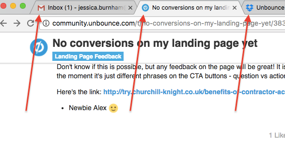
A favicon is the small icon that appears in the tabs, it’s generally a company logo. Here’s a screenshot to show what I mean:


When landing pages don’t have favicons, they tend to look a little less “official” and a bit incomplete. Thankfully, we’ve got some great documentation here on how to add a favicon to your page. It’s a small but affective addition.

There’s a lot of copy in this page, and it’s good copy, but I feel like you could trim a few sections. I think the benefits of having a contractor account near the top of the page has a lot of convincing material, and so does Why hire a contractor accountant if I can do it myself? If you could choose one of those sections and then make it more prominent, rather than having 2 sections, that might make the page more digestible for your viewers.

Also, since Request A Consultation and What Are My Options take you to the same form, I’d suggest having less prompts that all have one clear message, maybe something like Find A Consultant.

Hopefully this was useful, I’m amazed that this is your first landing page! It’s looking great so far, but as Joe said, let’s get on the path to conversion glory! You’re certainly on your way.

Cheers 🍻

Hi Jess!

Thanks for the suggestions, very very helpful. I have added favicons now - can’t believe I didn’t think of this before. Hopefully it’s a small step in the right direction.

As for the two sections you mentioned, I started with a bit of a compromise and am A/B testing with the page as previous and the variant without the section ‘what can a contractor accountant like Churchill Knight help with?’. I think this makes it flow a bit better visually speaking, but if it doesn’t work I’ll take your other suggestion.

I also chose one message on my CTA buttons rather than the two aforementioned ones - it now reads ‘Request a Consultation’. Hopefully this helps.

Stay tuned.

You are speaking in third person, change to first person
Put the benefits “above the fold”

Userlevel 7
Badge +1

I love that tip, Harold! That could be a conversation on it’s own: When to use first-person vs. third-person language on your landing page. Nice one!

The LP of Alex is very complete. Only needs some variations to get conversions. By the way, Jess, I am developing a CRO Tool called AxBizz

Userlevel 7
Badge +4

Hi Alex,

I agree with the tips shared above. Just wanted to add a few other observations.

I think the main issue is just cognitive overload, meaning there’s just too much text and too many different ideas coming at the visitor here. If possible try testing a variant of the page that reduces the text by at least half.

And make the page more linear, meaning there’s one main headline at the top, and then a call to action button/form, and then some bullet points below, etc. Make it so the visitor simply has to scroll down and get the full picture quickly and concisely. The way it is currently is a bit chaotic with lots of text that cause the visitor to jump back and forth a bit.

Also, consider simplifying the language and focusing more on what the accountant does, rather than on the “having a specialist contractor accountant.” People care more about the results of the accountant, and how those results can impact their business than on the act of hiring an accountant.

Lastly, consider adding some trust logos of partnerships, or places the brand has been featured, or clients, etc. Something to help build trust with the brand.

I hope this helps. Best of luck with the page!

Hello all,

I don’t think I agree with AxBizz’ suggestion, unless I am not understanding it correctly. Using ‘I’ when writing professionally is a big no-no, so could you please elaborate on what you mean by ‘first person’?

I do like Nicholas’ suggestion of cutting the text down and focusing on what we as an accountant do, however again I’m confused by what you mean by ‘linear’, as we wouldn’t want to have a form sitting there on it’s own with all this white space around it (what linear means to me). Just need a bit more explanation here.

I do have a client testimonial but adding more would help 🙂 and I could add our affiliate logos there too. Thank you!

Edit: I had an epiphany, after looking at the landing page I get what you meant by ‘linear’ and ‘first person’ and I’ve made adjustments to my second variant to A/B test it, with the form also being much higher above the fold. Fingers crossed!

I’ve subscribed to this thread, simply because there’s a ton of great suggestions offered and I’m super curious to see if these changes result in a conversion rate lift. My gut says it definitely will.

Also, I 100% agree with @Nicholas’ tip :

There’s an old (but still relevant) post from the Unbounce blog that goes into more detail about this here:

http://unbounce.com/conversion-rate-optimization/psychology-of-social-proof/

Can’t wait to see the results from this A/B test!

Hello all,

Just a quick update:

I’ve had a conversion!!

I feel like there’s still improvements to be made though, as we’ve only had the one and we’re over 250 visitors to the page. The conversion came through before I added our affiliate logos, but I have moved the form above the fold and made the whole page more linear.

Feel free to take a look but I am running out of ideas to A/B test the page to try and get that conversion rate up.

Userlevel 7
Badge +4

Nice! I really like what you’ve done with the page. Looking sharp now.

Reply