Hello, my first page attempt with unbounce.
This is for lead generation for a screen printing shop, traffic will be from adwords search. Desktop only, haven’t fussed with the mobile yet.
keywords: custom printed t-shirts, screen printed t-shirts

Hello, my first page attempt with unbounce.
This is for lead generation for a screen printing shop, traffic will be from adwords search. Desktop only, haven’t fussed with the mobile yet.
keywords: custom printed t-shirts, screen printed t-shirts
 +4
+4
Hey there Bill,
Very, very nice design! The page instantly got my attention. Good job with the headline too, that immediately tells me what your value proposition is.
On the design side, there’s not much I’d change. Just wanted to point out that there appears to be a thin white border between the section with the three benefit statements and the “american made t-shirts” section. Not sure if that’s intentional or not, but if it is, maybe balance it out with another white line/border in the hero image section above.
Also, maybe consider making the 3 icons and the text in that section a dark blue to match your logo color, instead of introducing a new color (#000000) on the page. And maybe bump up the font size slightly for better readability.
Lastly, a lot of the black text is center aligned. You might want to left-align it for readability. That is something Oli from Unbounce talks about from time to time. Centered text might look better, but it creates more friction for the reader since their eyes have to jump around a bit more.
On the conversion side, the only two things to mention are:
It would be great if the photos of the people wearing the shirts showed their faces. I know you’re trying to focus on the shirts, as that is the product, but to see someone smiling, who is wearing the product can work wonders at times.
Do you have any testimonials from past customers? It would be great to include those on the page, with some headshots, or at least some form of social proof.
PS: The second CTA button on the page doesn’t work when I tried it.
Altogether, this is an excellent page! Hope some of this feedback is helpful.
Regards,
Hello!
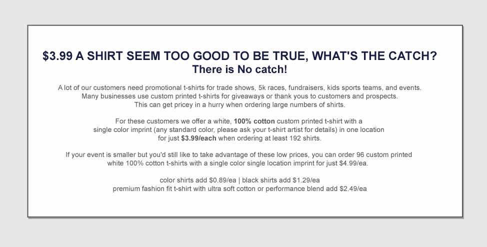
The price caught my attention in the first part of the layout and it works very well.
However, I got a little bit confused in the last part of the layout:
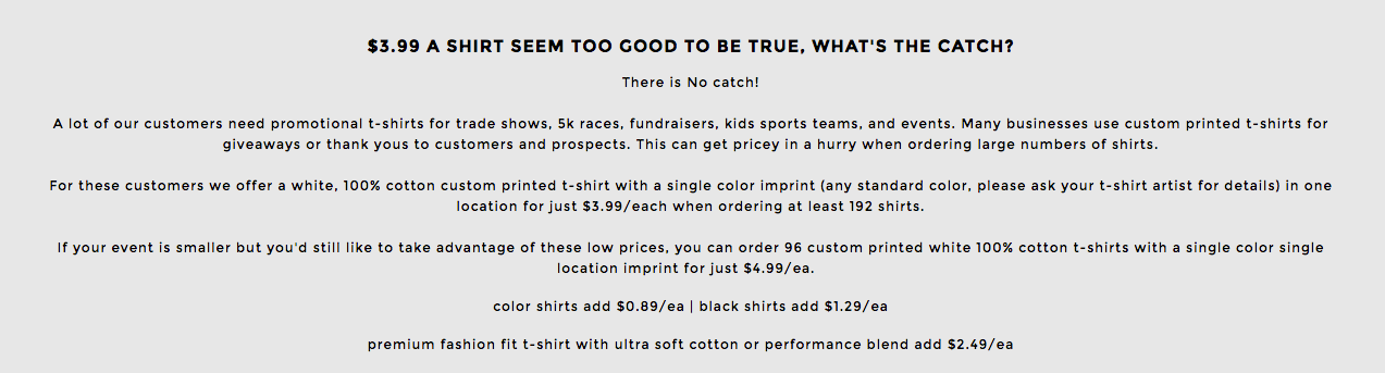
When I see too many letters its seems a trap for me.
Maybe would be good to display the information using a table. Example:
Cheers =)
Sorry @wthomasoh, can I say one more thing?
Maybe you could create one more page with the focus 100% on the 3,99 t-shirt.
You could insert a timer to create a sense of urgency. Example:
BIG PROMOTION! ONLY 3,99!
Hurry, This offer ends in…
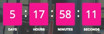
You could setup an A/B test to see which page performs better.
One more time… Congratulation! It seems that you have a really good business =)
Good luck!
Wow, thanks so much for the detailed feedback - it’s much appreciated.
Not only is the application pretty great, the community is friendly too! I think I’m going to like it here!
Ahhh… that’s a great idea! Thank you!
 +1
+1
Ditto to everyone else’s suggestions I would just add this:
Here’s a a very small example, could be worked on more:
Hi Bill,
Here’re a couple more suggestions from me adding to the rest.
I feel your copy in the header image will look neater with less line spacing, especially under the CTA.
I like the left aligned text in panel 2, and perhaps if you left align the column titles and icons it may look even better.
Something to test for the future is one final CTA button at the very bottom of the page (unless you go for 3x columns in the final panel with individual CTAs each).
Best of luck!
@Nicholas, @BrunoBrito, @digibomb, @Stela
Just wanted to thank everyone again for the generous and on-point feedback!
I’ve just published and will make some more tweaks and start split testing. Going add some testimonials as well but gotta get some clicks flowing today so this is where it’s at. 😀
No account yet? Create an account
Enter your username or e-mail address. We'll send you an e-mail with instructions to reset your password.