Easy To Understand? Need flow/visual feedback


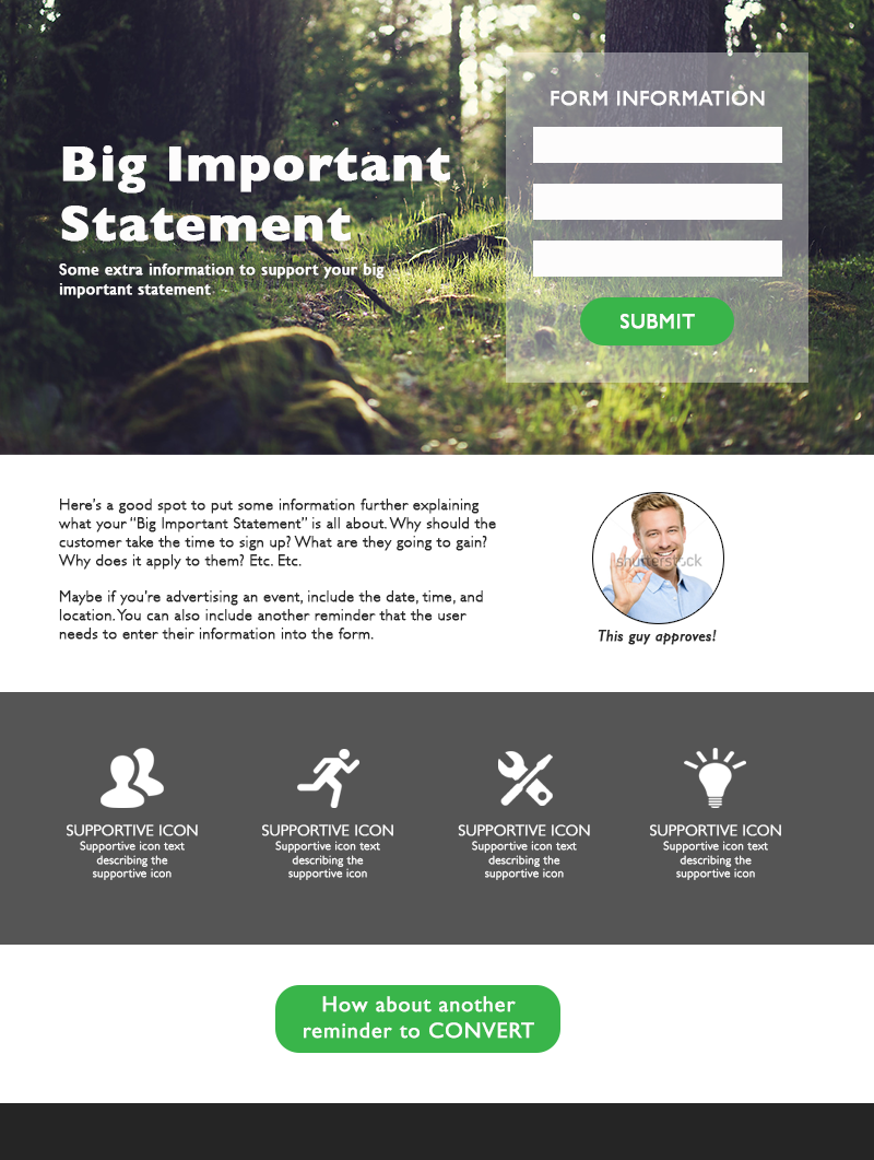
Trying to redesign our standard template to fit in more with our brand, be more dynamic, and work with Marketo forms.

Feedback on this page would appreciated, especially if you find it easy/difficult to understand that you need to complete the form and what the content is about.


11 replies

Userlevel 7
Badge +1

Hey Yoav! Thanks for reaching out here 🙂

This landing page is looking pretty great so far, once I read all of the content it’s very clear what I’d be signing up for. The second CTA towards the bottom seals the deal, and I like that your use of icons in the “Register & Get The Latest Insights On” section.

My critique on this page would be to give a bit of breathing room to some of your content. Especially since the first line of body text says “Your audience is inundated with content”. Users can be lazy, and if they need to do much reading, it increases the chance that they’ll bounce.

I’d move the body copy down to a different section, perhaps slightly below the fold so that when a user lands on your page it doesn’t look like they have to do too much reading. You could have a split section where on one side it explains the importance of Video Storytelling, and on one side there’s an About The Speaker section.

I’ve made a bit of a mockup of how I recommend content to be spaced out:

Super nice implementation of the chat feature, and I’m always impressed by a good favicon. Way to go! I’m curious if the @Unbounce-Experts have any further input here. 😁

Userlevel 6
Badge +4

Great input from @Jess here!

I would also do some minor changes to the form. Move the labels above the form fields. It’s easier for the eye to process information in one fluid motion downwards than having to switch back and forth from the label to the form field. Might seem like a minor issue, but these are the things that really make a difference.

I would also make the form stand out more from the background. That way you visually guide your visitor towards the form.

Whenever in doubt - A/B test 😉

Userlevel 7
Badge +4

Hey Yoav,

Nice page! I agree with the points raised by @jess and @finge. So not to repeat anything, here’s just a few more things I’d consider testing…

  1. Add a few testimonials. This can help your visitors picture themselves in someone else’s shoes as they consider signing up for the webinar. Highlight testimonials from people who have attended this type of webinar and have gotten value from it.

  2. Add trust logos. Do you have any partners or certifications or affiliations that would add credibility to your brand and your page? If so, it doesn’t hurt to add them!

  3. Lighten up the background or use a different image. The image that you’re using in the background doesn’t say “visual storytelling” to me. You might have to put the text in a box, or somehow work with it to make sure the page copy remains readable.

Hope this helps! Great job with the page. And let us know how it works out for you.

regarding A/B testing - my problem right now is that conversion tracking is not working, since I am embedding the form from Marketo. Any idea how to implement tracking conversion in such a case [this is obviously worthy of a separate post, but since it’s all related, just thought i would through it out here…]

Userlevel 6
Badge +4

I recommend using Google Analytics for conversion tracking, but that’s a broader topic.

Instead of embedding a Marketo form, use the built in form and use the Marketo Integration instead.

The Marketo integration does not launch the marketo munchkin tracking ID, which is why I prefer to embed the form rather than use the integration…

I agree with the @Unbounce-Experts here. I’ll add that the form needs brevity.

Remove last name. Make “first name” as “Name”. Change “professional email address” to “Email”. Change “Company name” to Company.

If you really need the “company” and “title”, it’s alright. If you can do without, remove those fields.

Change The CTA to “ACCESS RECORDING” or “WATCH IT” or something. Using just “Access” doesn’t seem to flow.

Ash

thanks…most of those fields we need since we are a B2B biz…i like your comments about CTA word choice though. going to change that now…

Awesome, @yoav. Please do let us know how it goes. I do hope you have two versions to test?

Ash

Userlevel 7
Badge +1

Love the way you broke those down @Ashwin_Satyanarayana - I am a big fan of minimalism 🙂

minimalism. Me too. Big fan @Jess 🙂

Reply